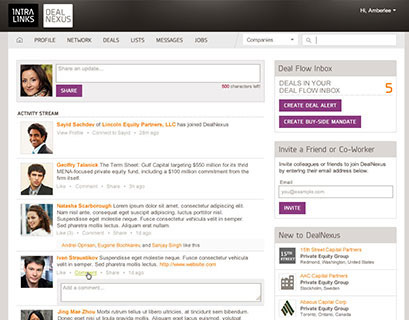
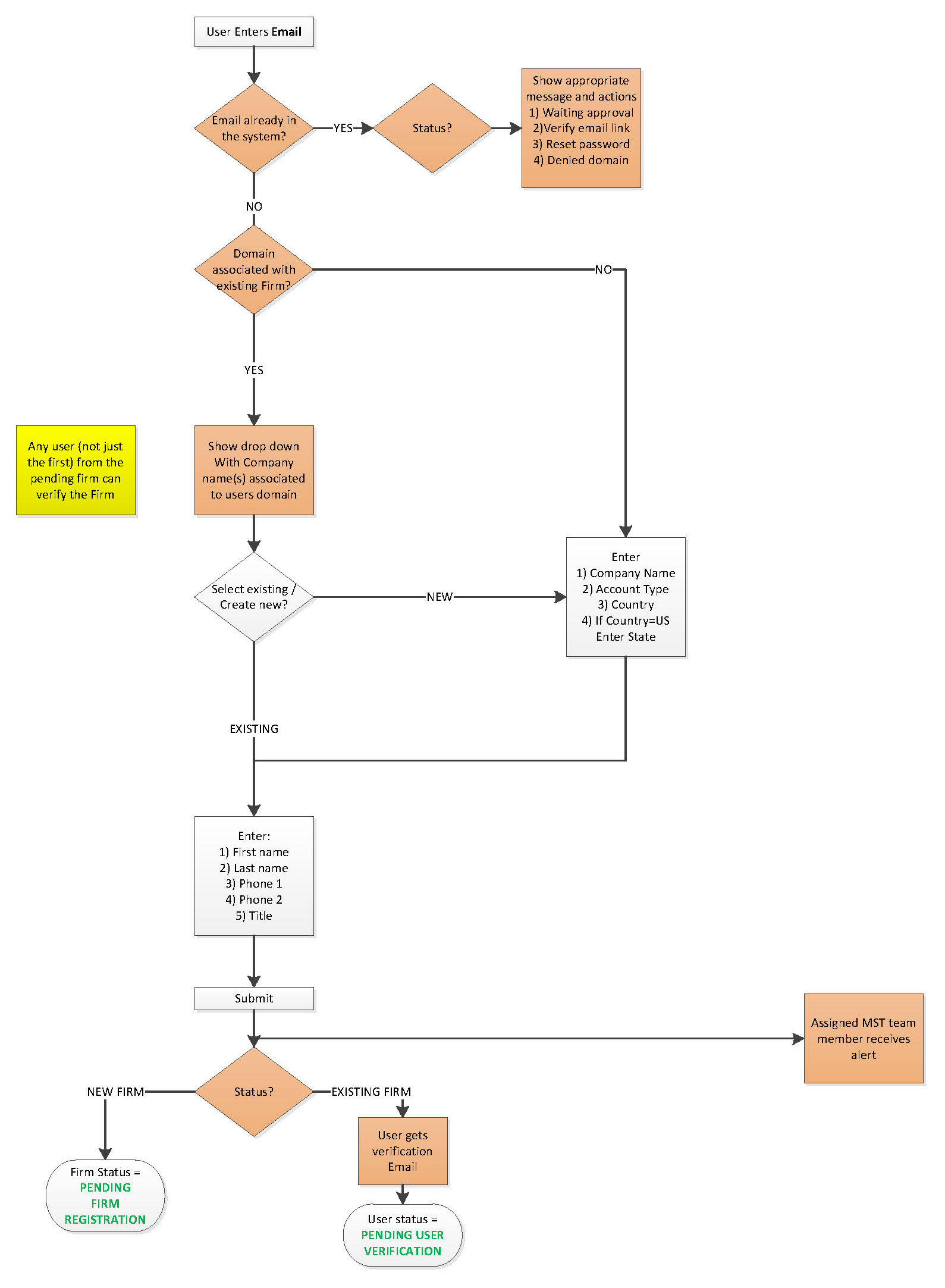
The previous registration process created a lot of friction due to the 2 page long registration form. The initial part of my redesign asked only for the registrant’s email. From the email address we ran a series of verification checks…this:
• Reduced the number of repeat registrations (whether the user was blacklisted or still awaiting approval) thus reducing the sale’s team workload from deduping registrations.
• Allowed for speedier registration if the registrant’s company was already in the Dealnexus Ecosystem (the user would not need to re-enter company’s profile info—vital for Dealnexus’ propitiatory matching engine)
The user then only need enter their individual details to complete the 1st phase of the registration process. Working with the project management and support team, we were able to strike a balance between giving the support team enough information to begin the verification and approval process without burdening the user.
Improved Registration Flow
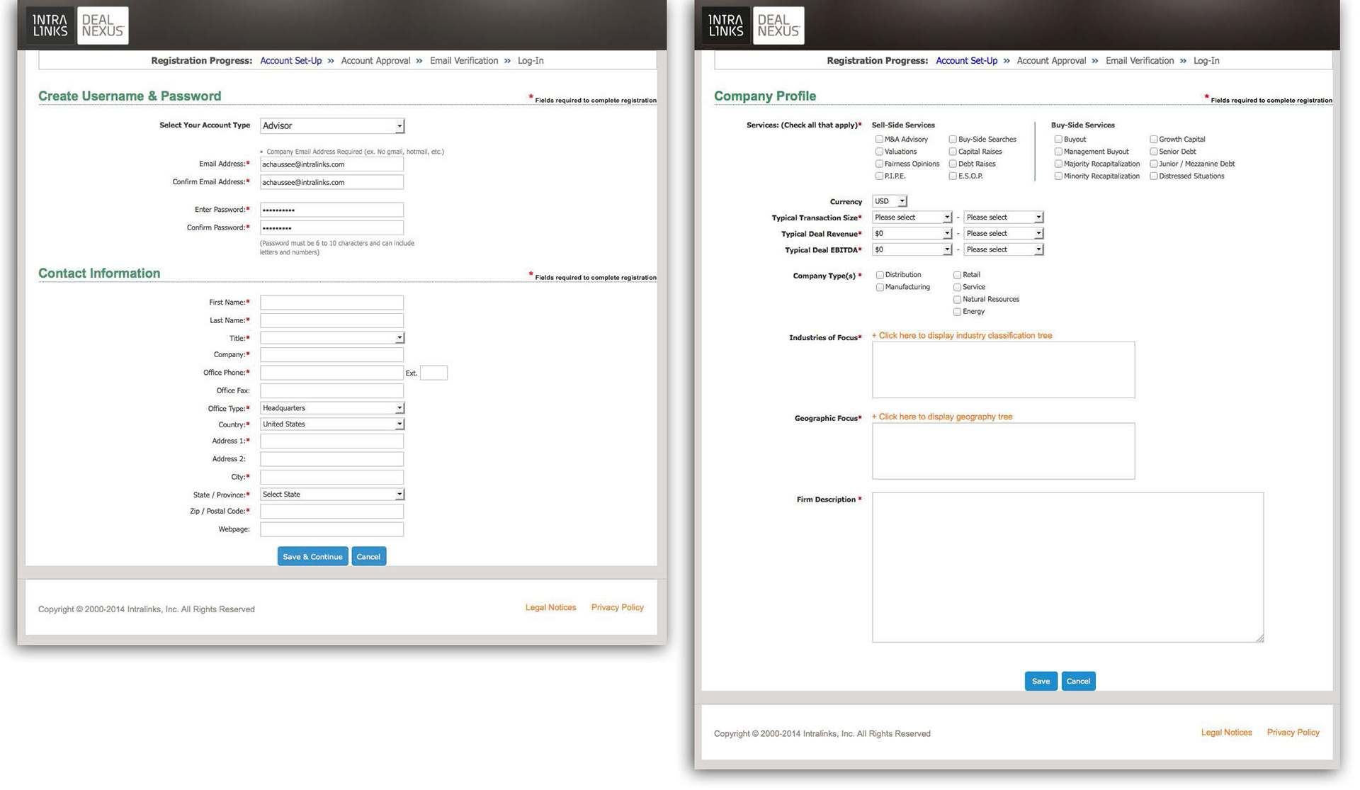
Old 2-page registration
After the user’s account has been approved and they proceed to login I created a guided step-by-step modal to verify or complete any unfinished information. This step-by-step allows the user to know their progress; the modal nature of the design gives the user a sneak peak and entice the user of what is to come once they complete all the profile information.