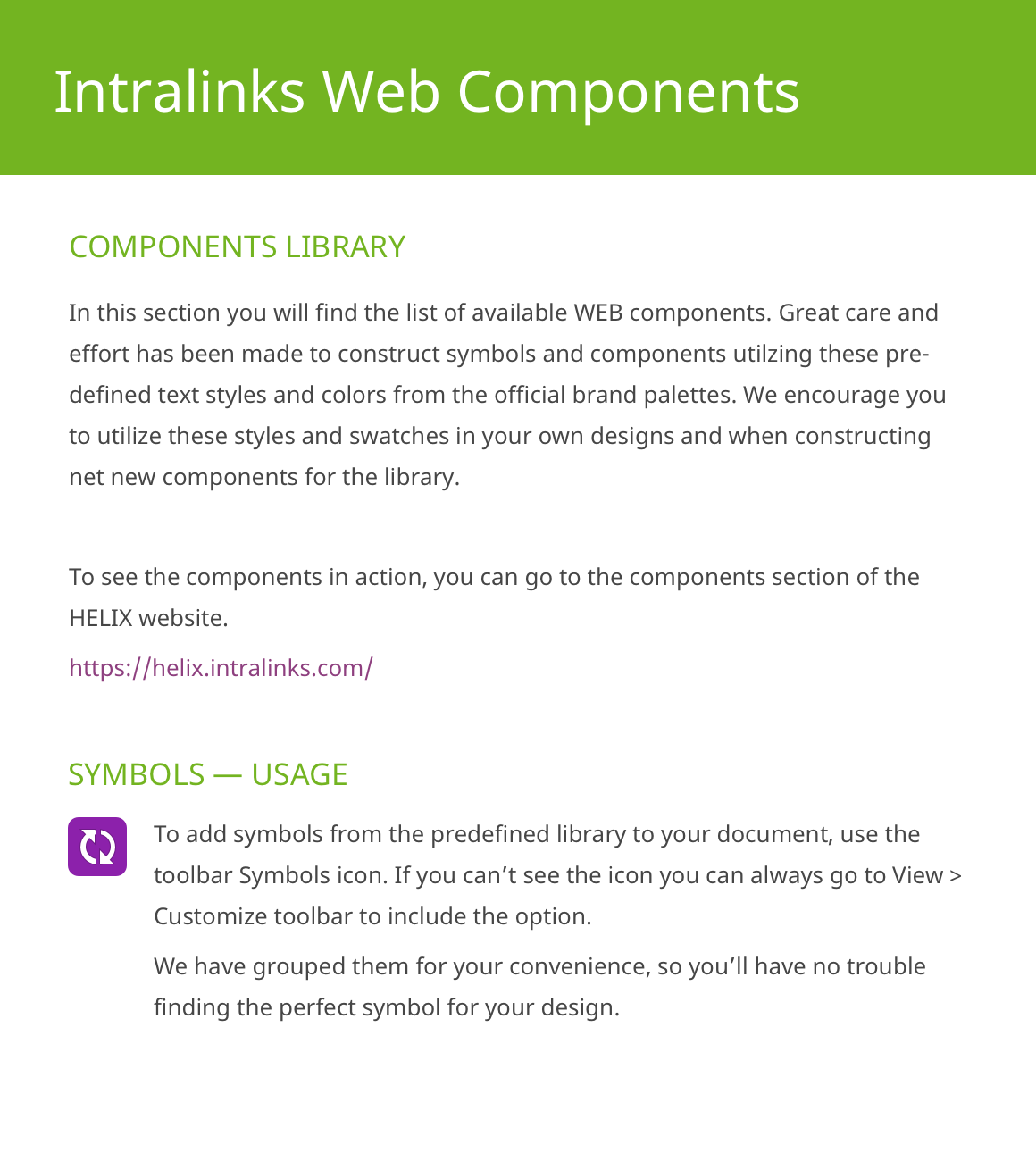
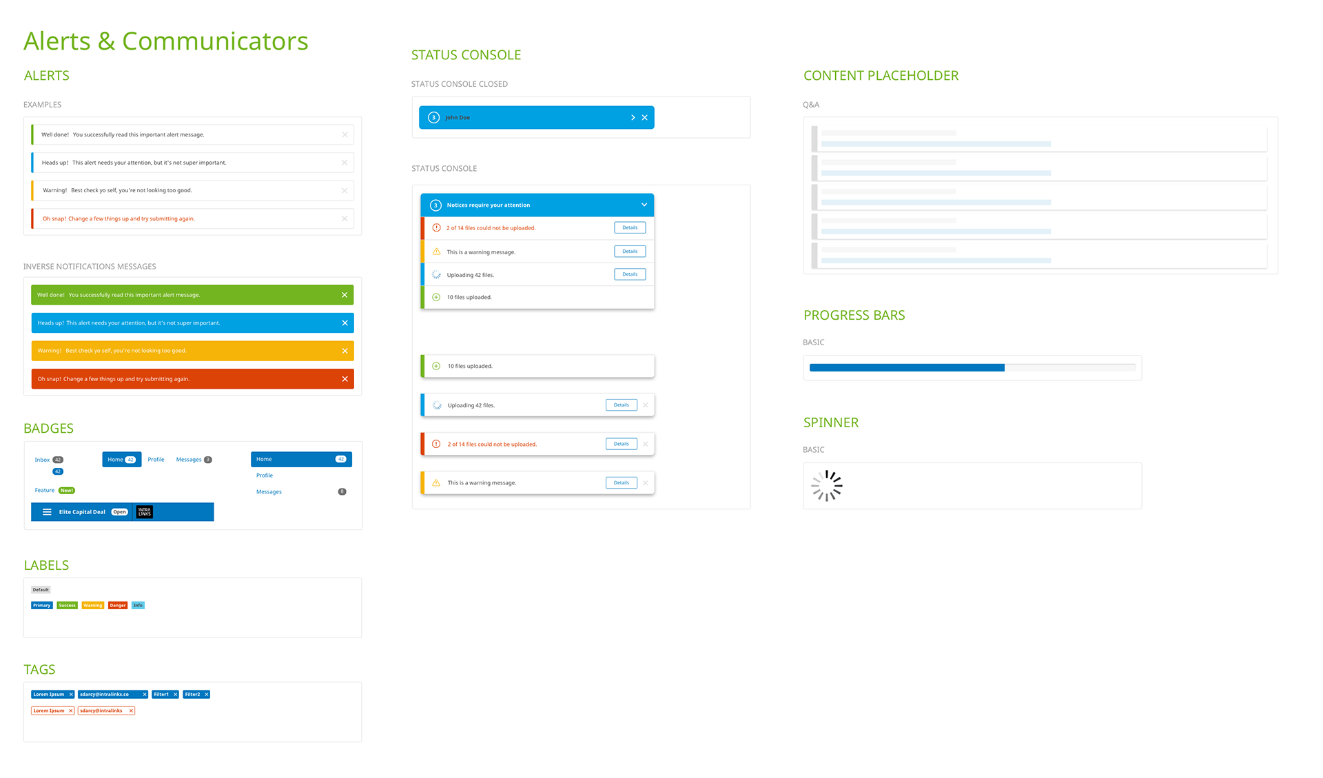
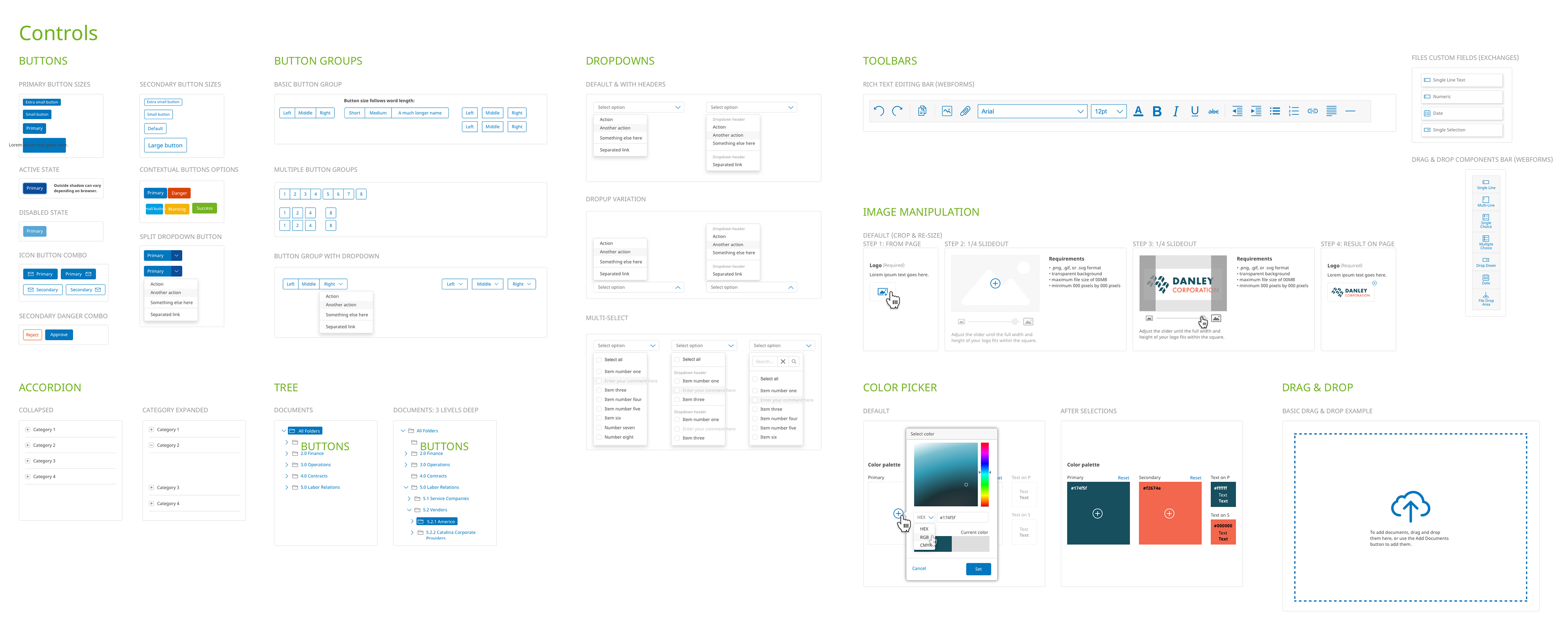
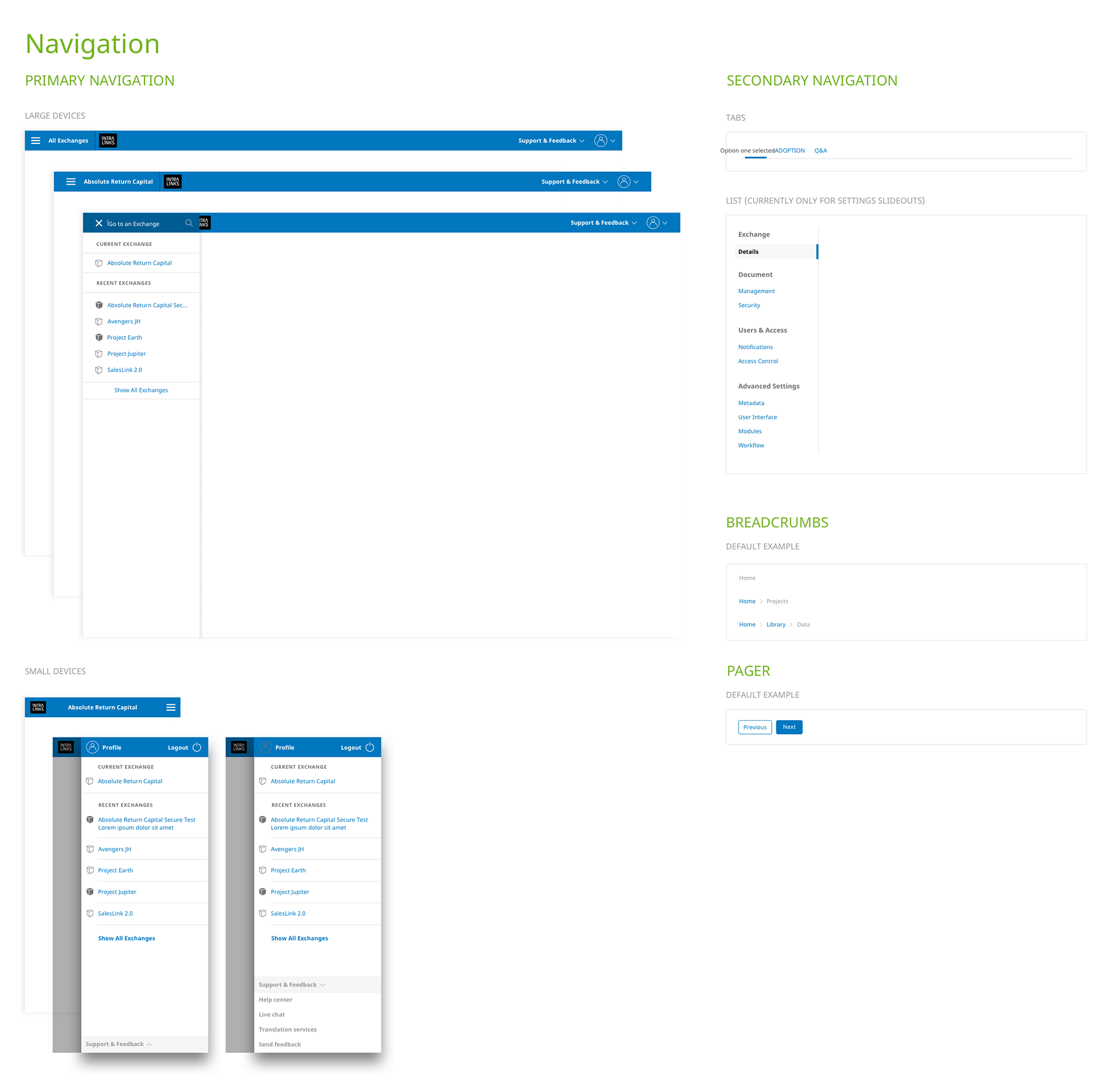
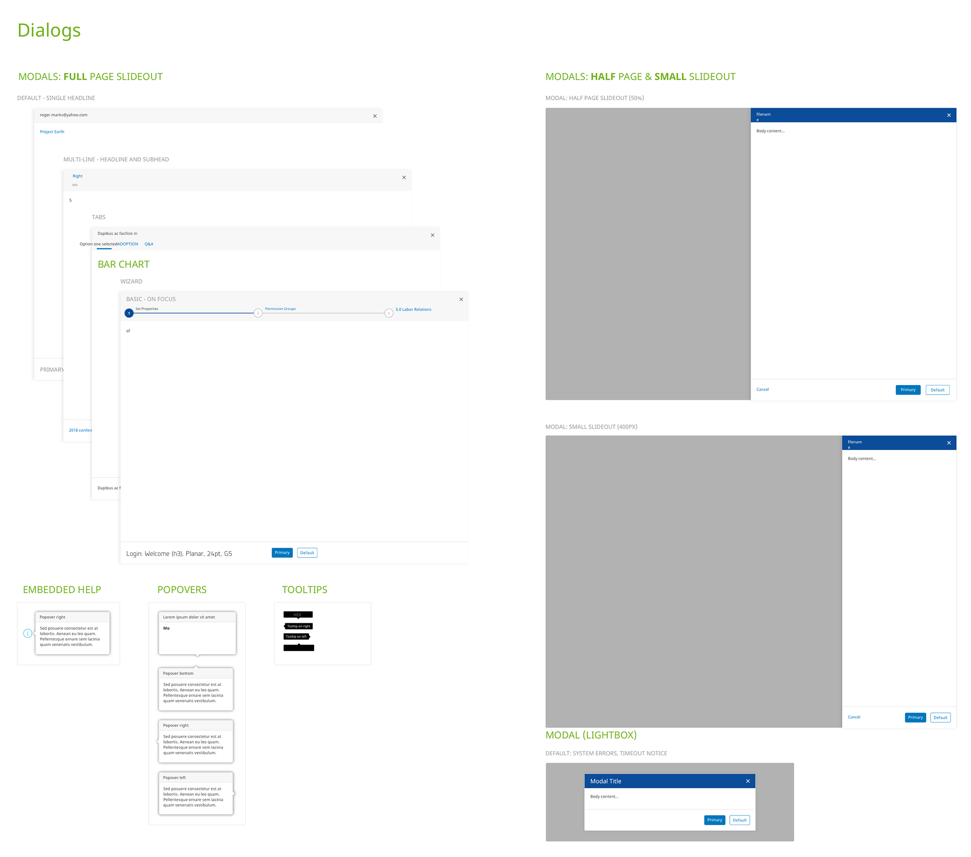
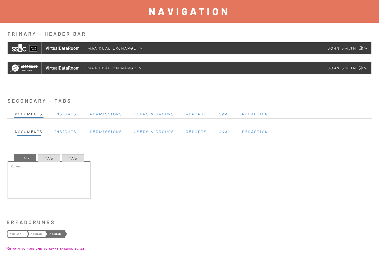
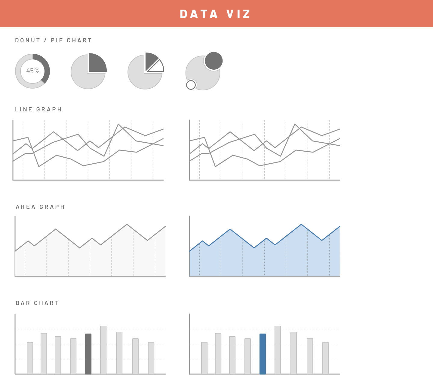
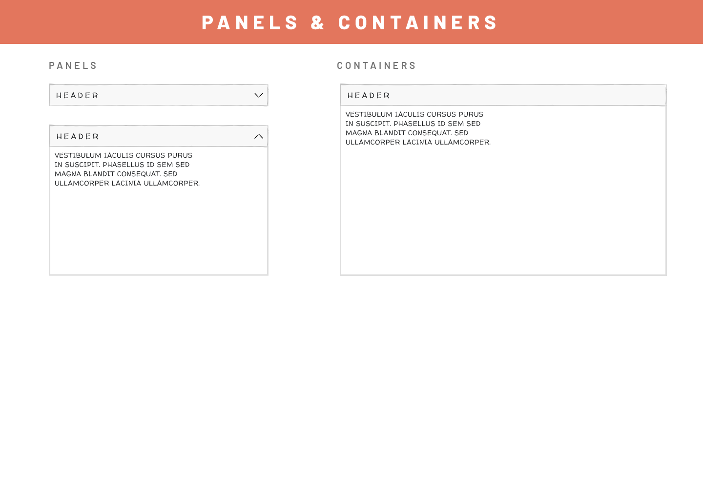
Want to ensure designers adopt and implement brand guidelines, patterns and components correctly? Providing a full, shared, and always up-to-date library certainly helps!
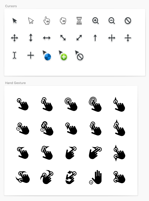
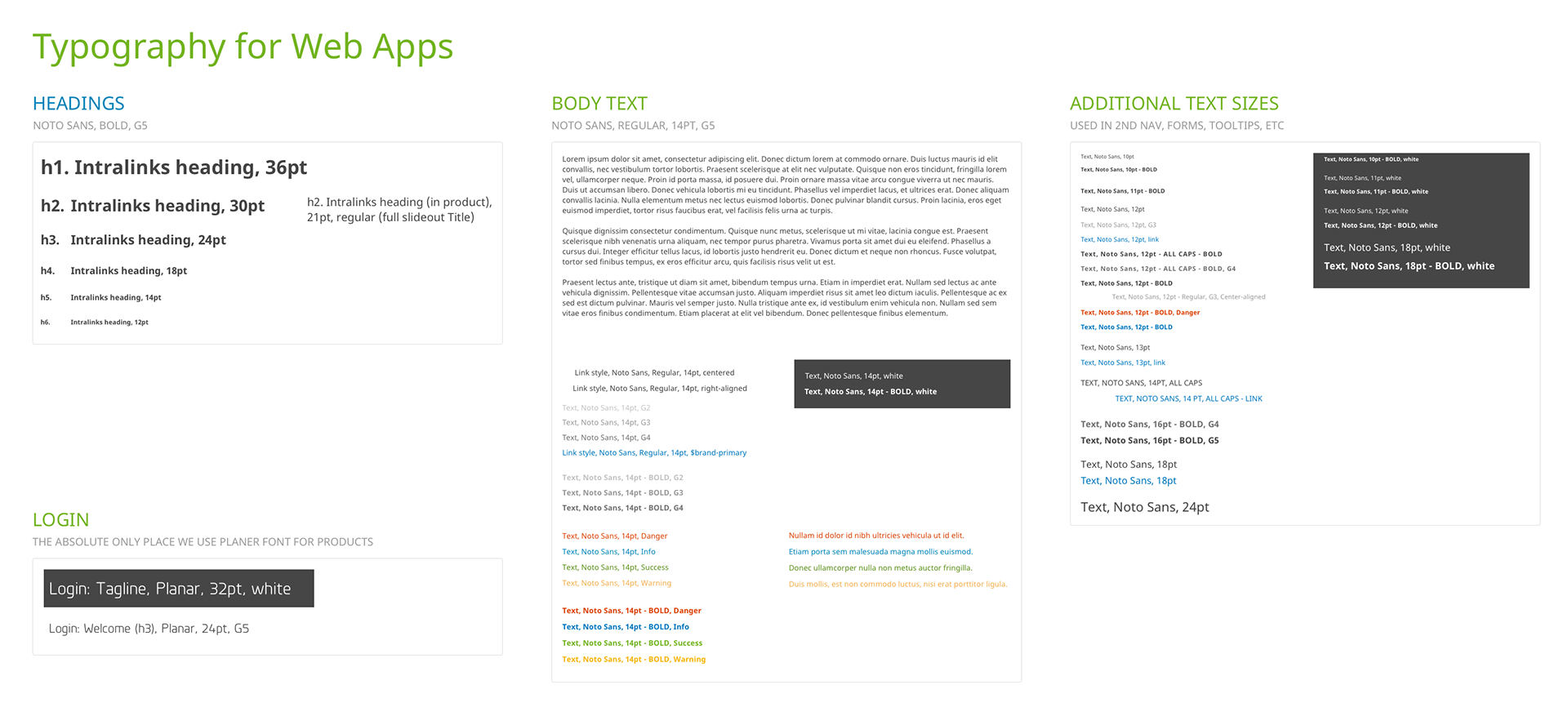
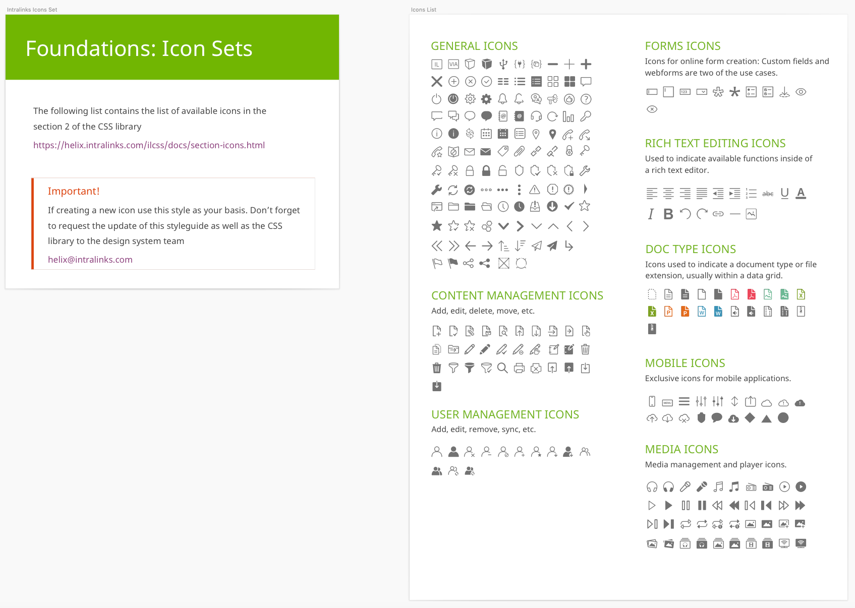
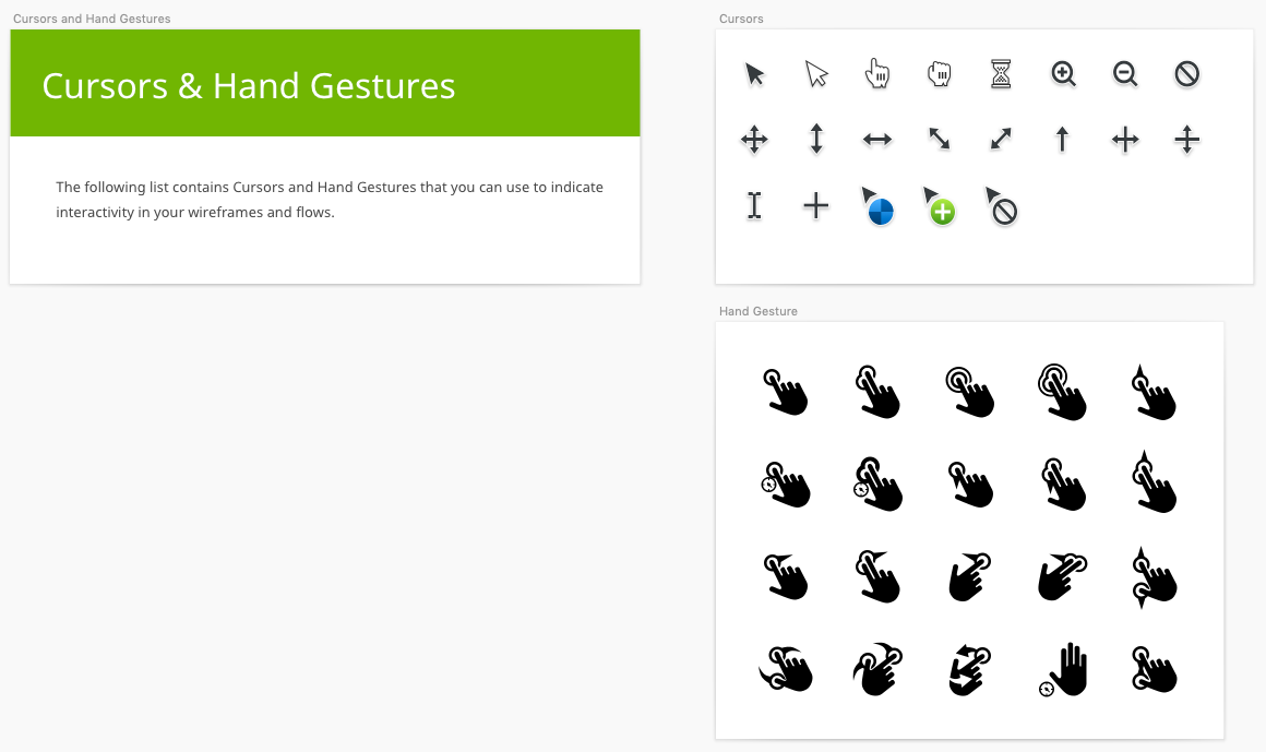
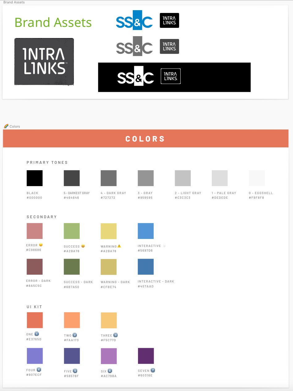
Among the many hats I wore as a founder of Intralinks first design system was to ensure the library of components (Sketch file of component symbols, icons and foundational guidelines) was complete and accurate. I worked with fellow designers to ensure any new components or patterns were added to the set and kept all designers in sync via InVision's DSM (Design System Manager) online cloud library and local Sketch plug-in that alerted designers when a new version of their component was implemented into the library.
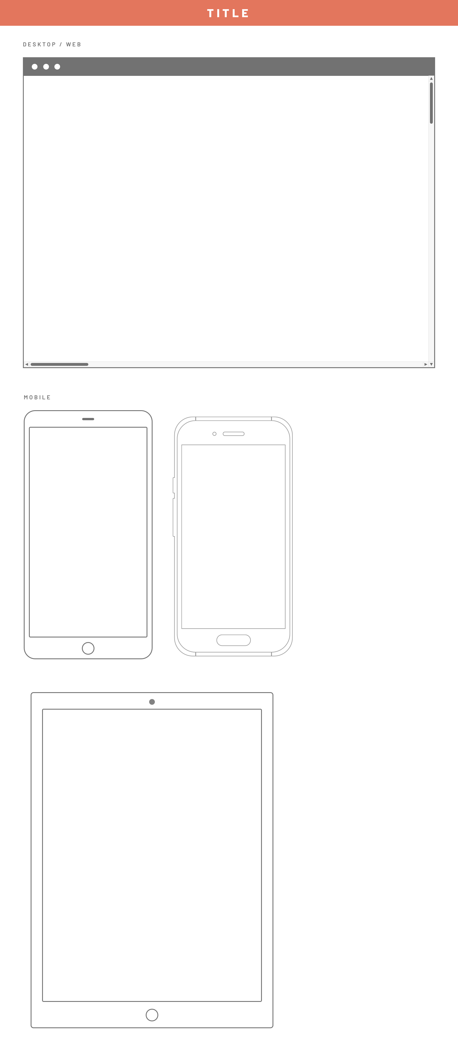
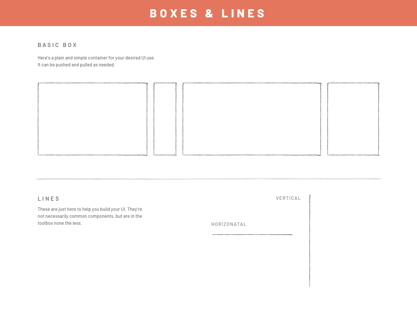
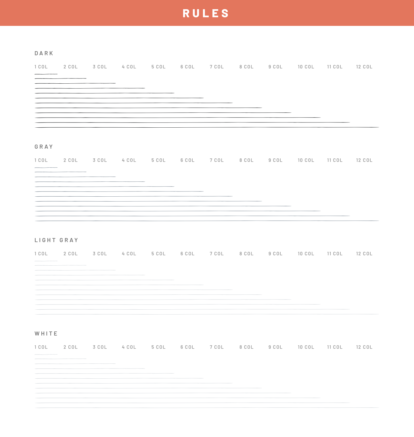
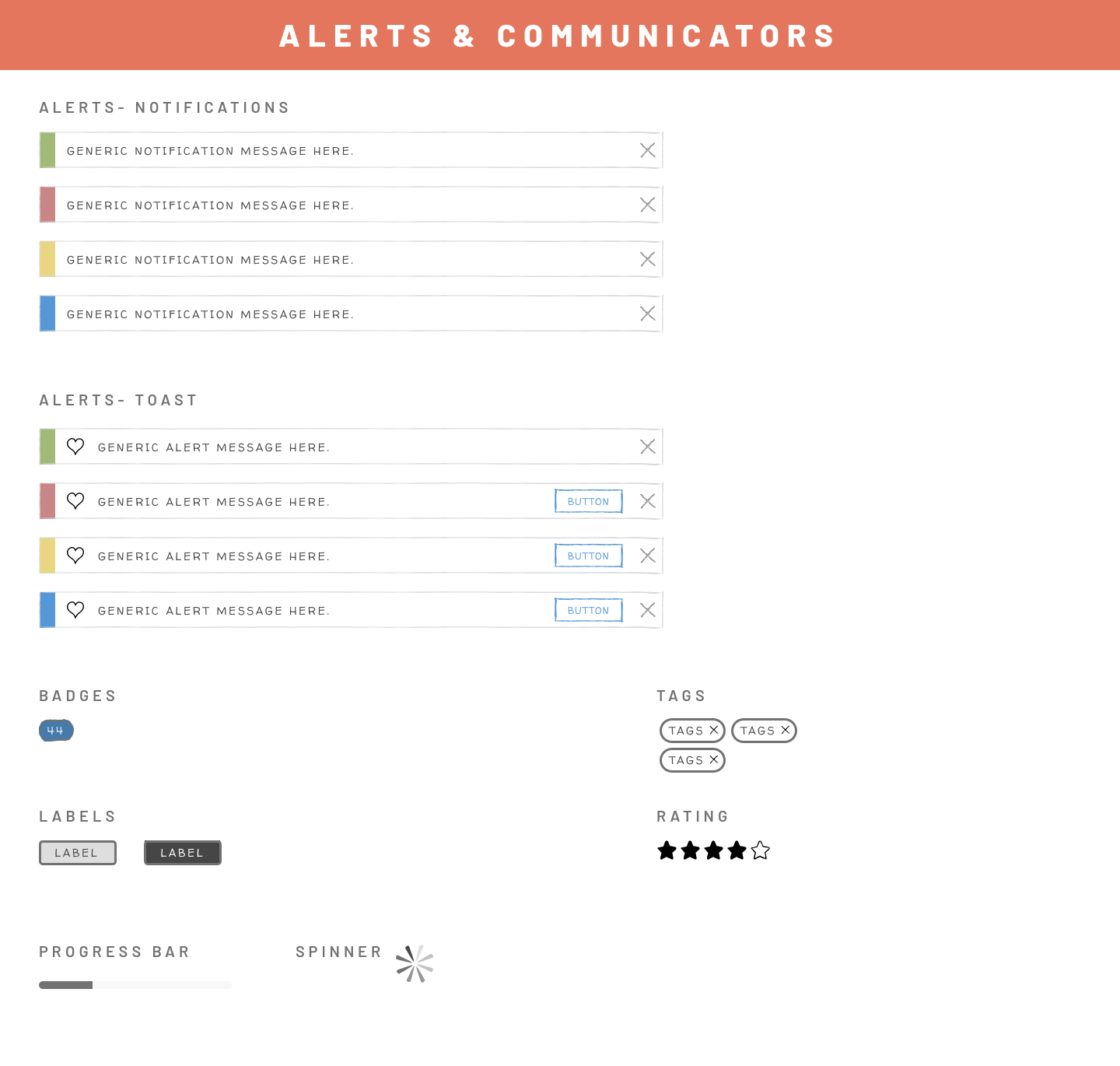
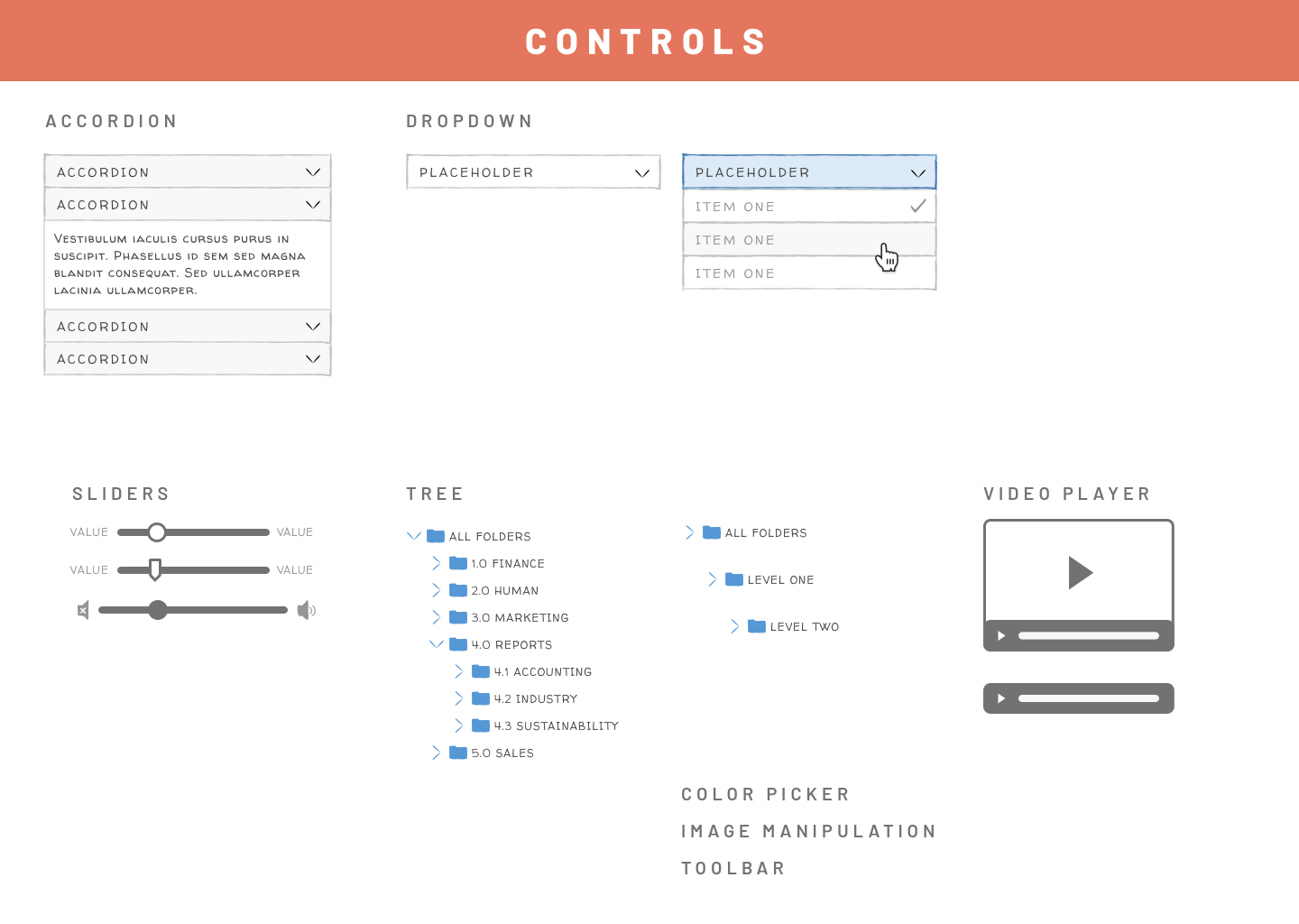
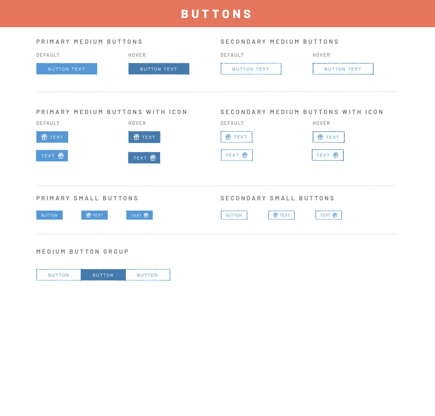
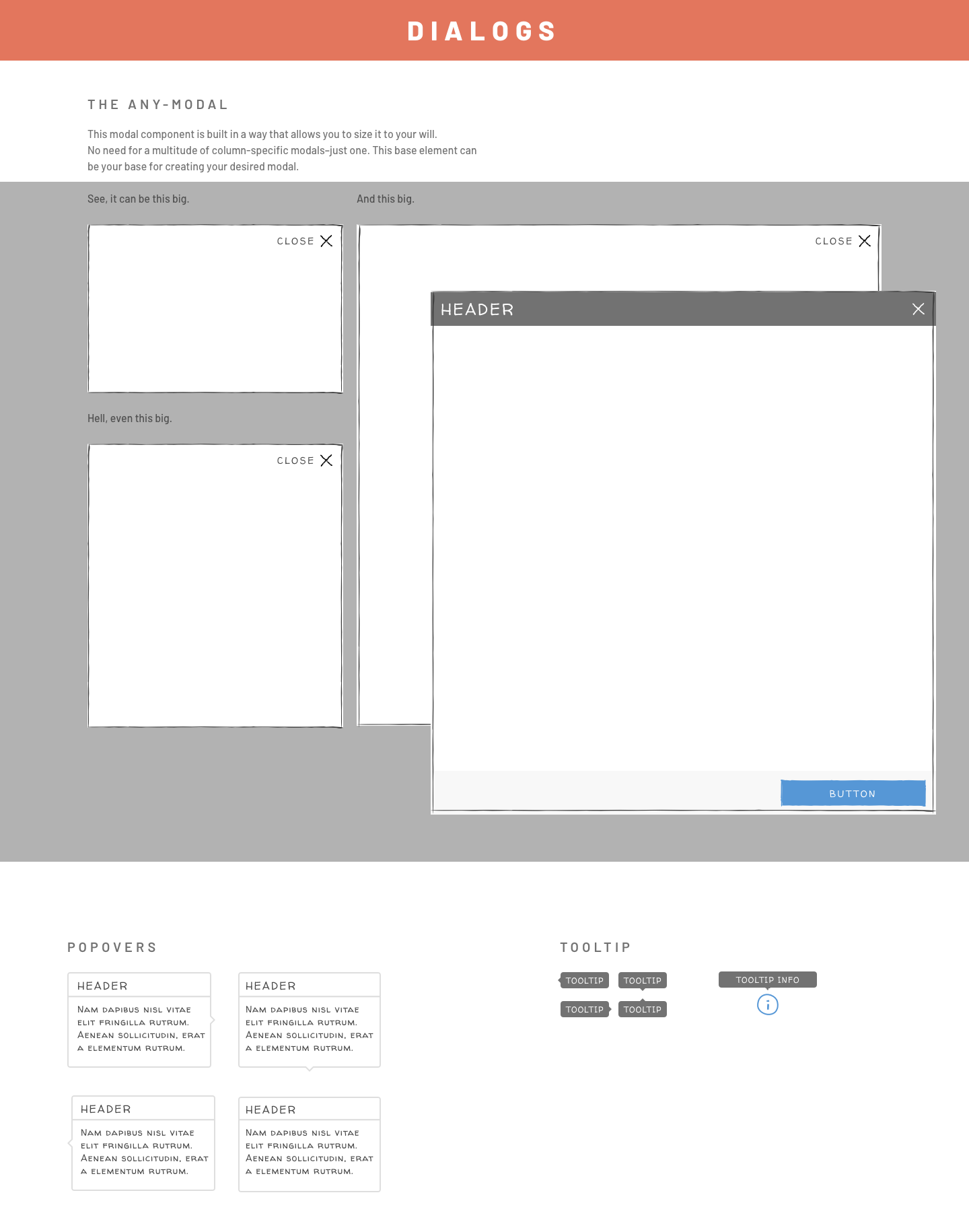
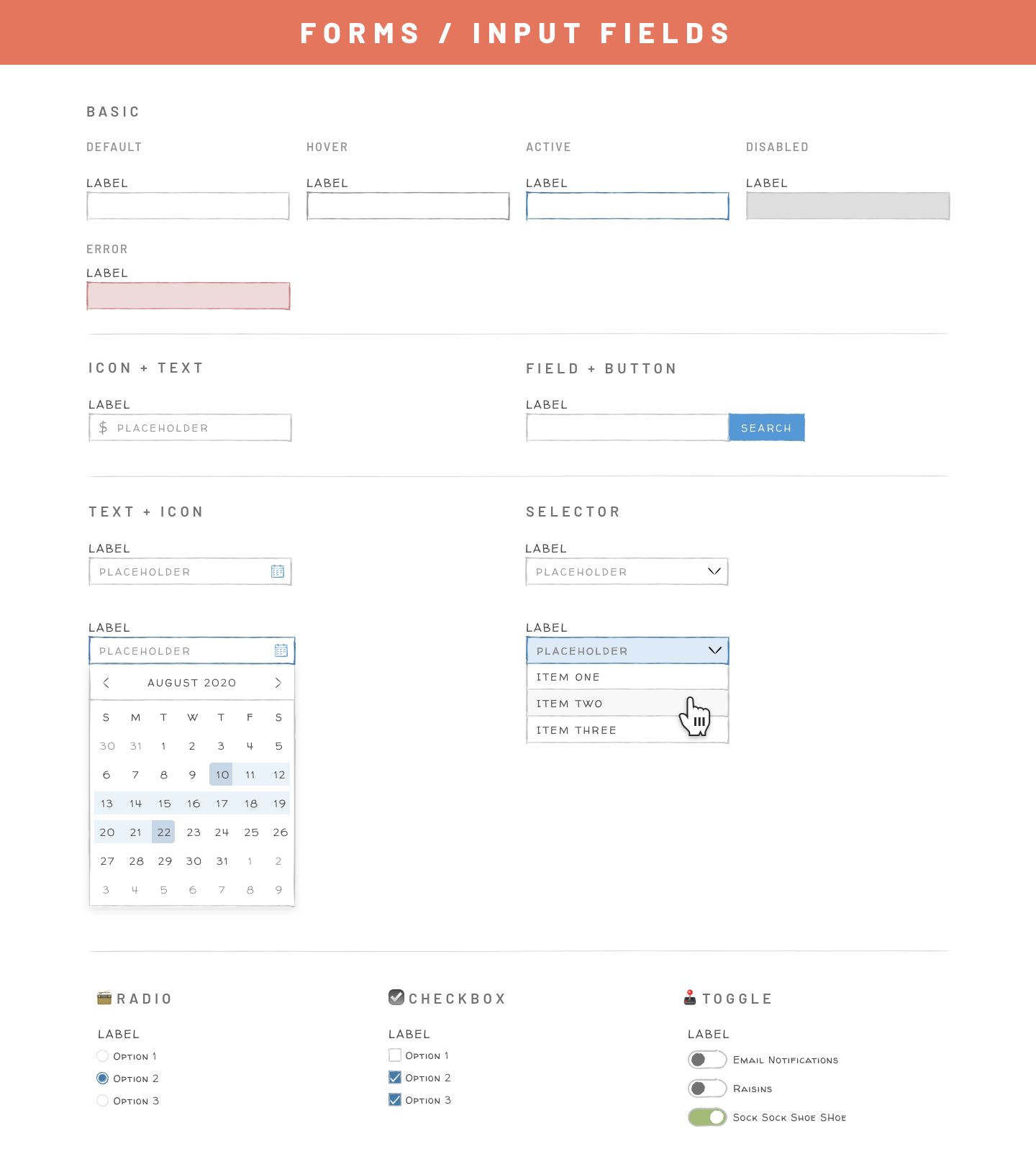
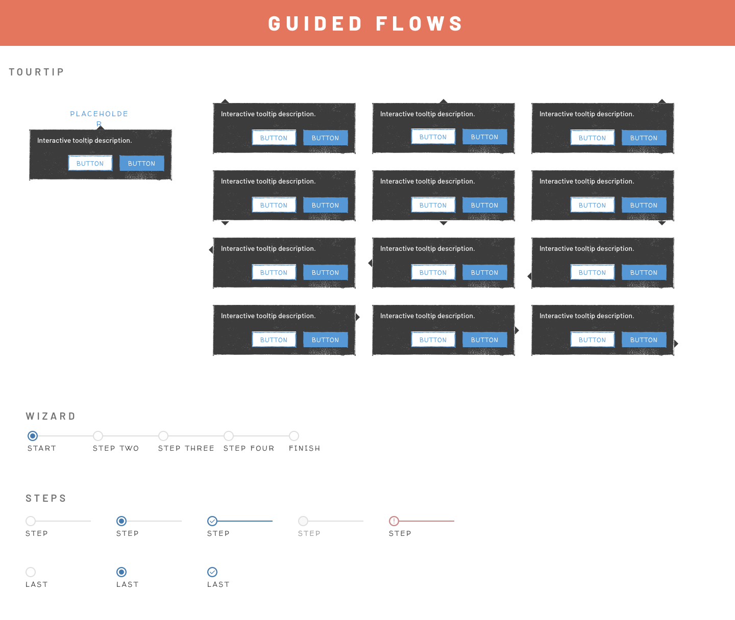
Lo-Fidelity Toolkit
As a team, we found that presenting initial concepts and ideas was sometimes difficult as people assumed it was the final version or over-focused on details within the interface instead of the overall flow and interactions. I took it upon myself to create this toolkit that I shared with all fellow designers to aid in their design cycles.
Several design decisions make this lo-fi kit successful
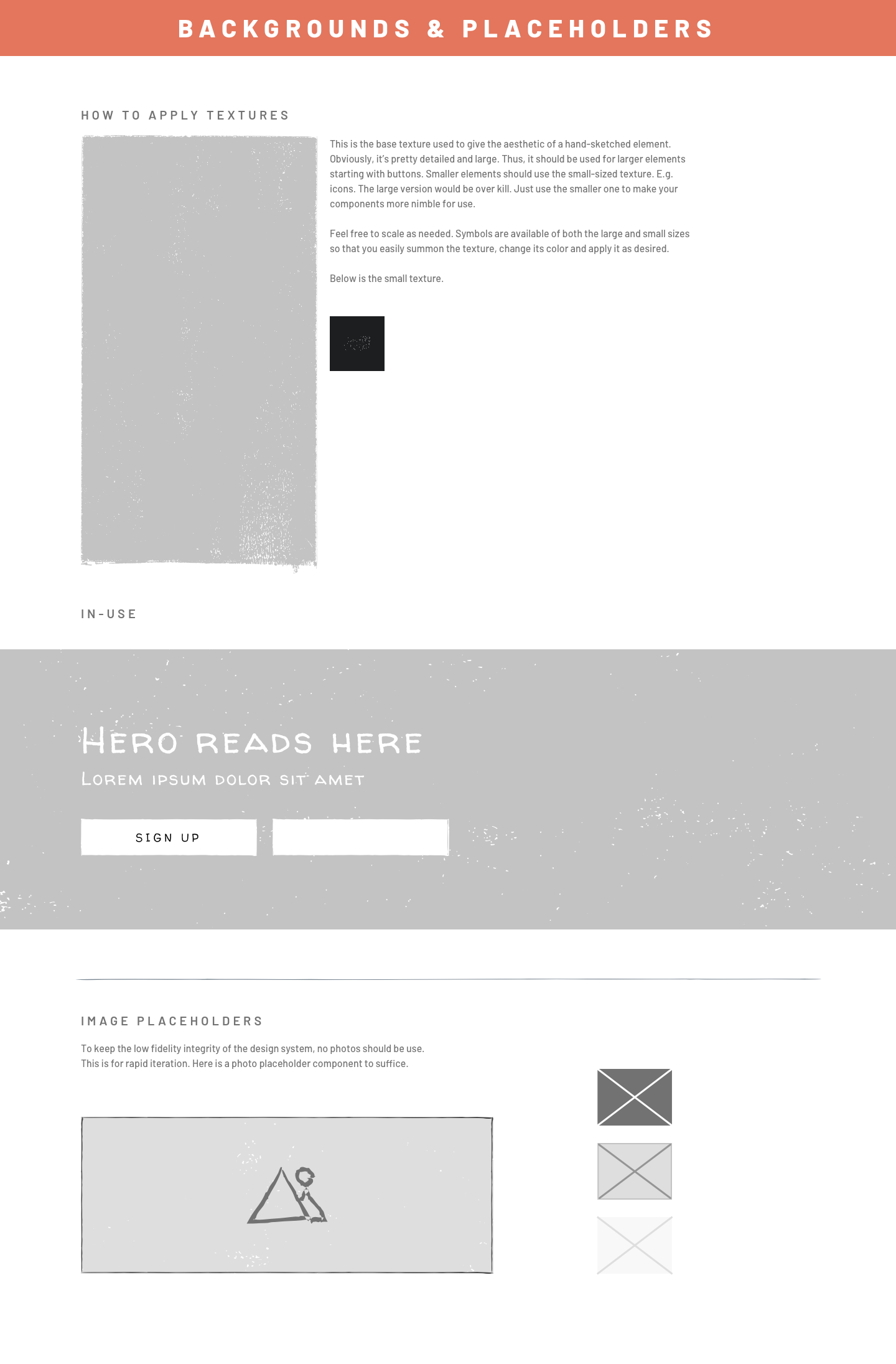
• Colors are different enough from official brand so that they are not confused as final versions
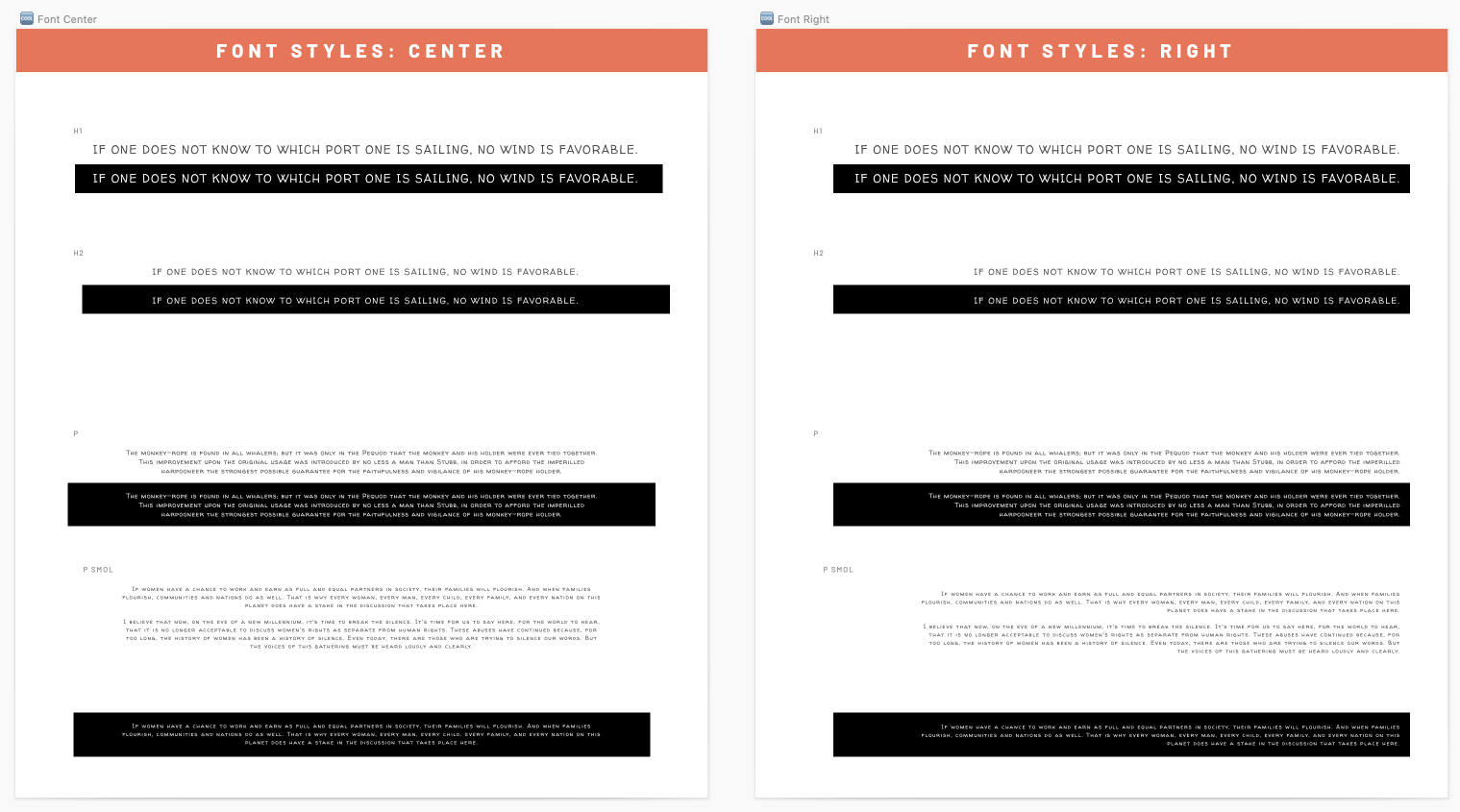
• Interface elements and icons have a "sketchy" hand-drawn look to them
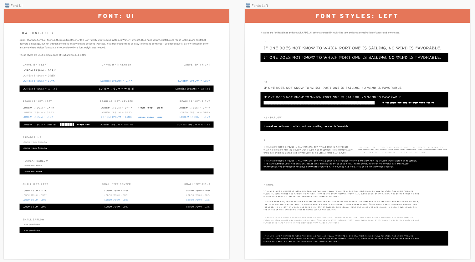
• Fonts used also have a hand-drawn look to them
• Components keep a similar scale so that quick mock-ups remain true to the overall layout and scope that high-fidelity UI rounds would have
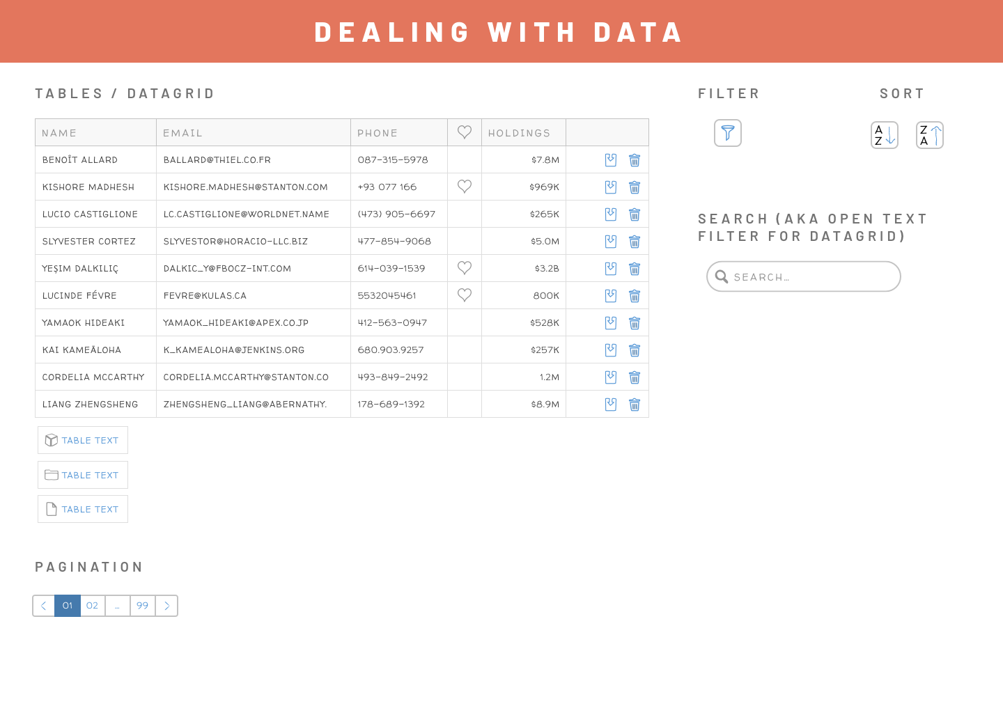
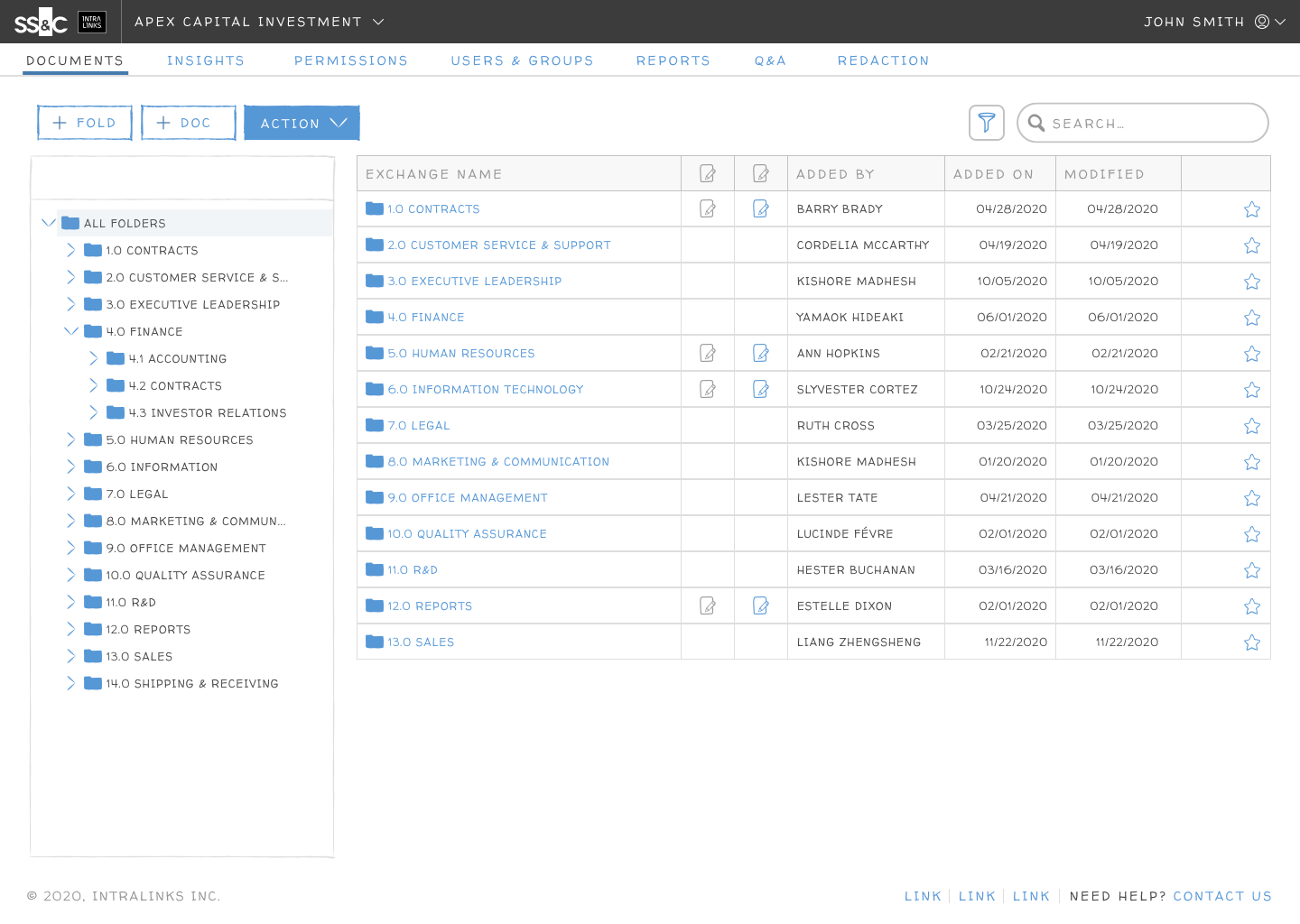
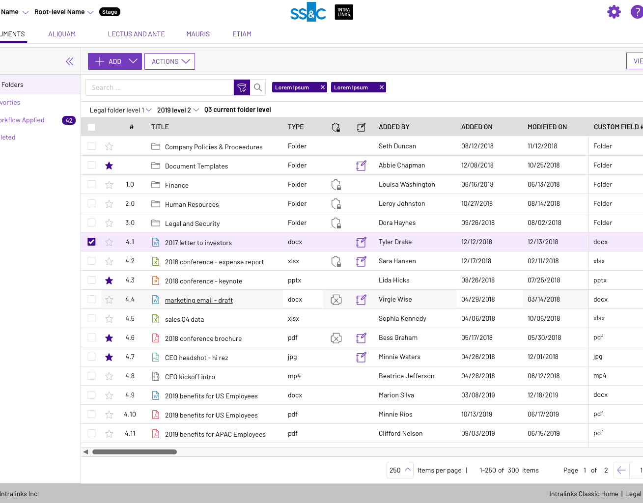
Example of most common page layout: datagrid
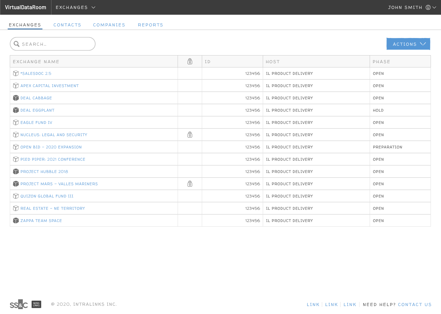
Example page layout: HUB (list of projects) landing page