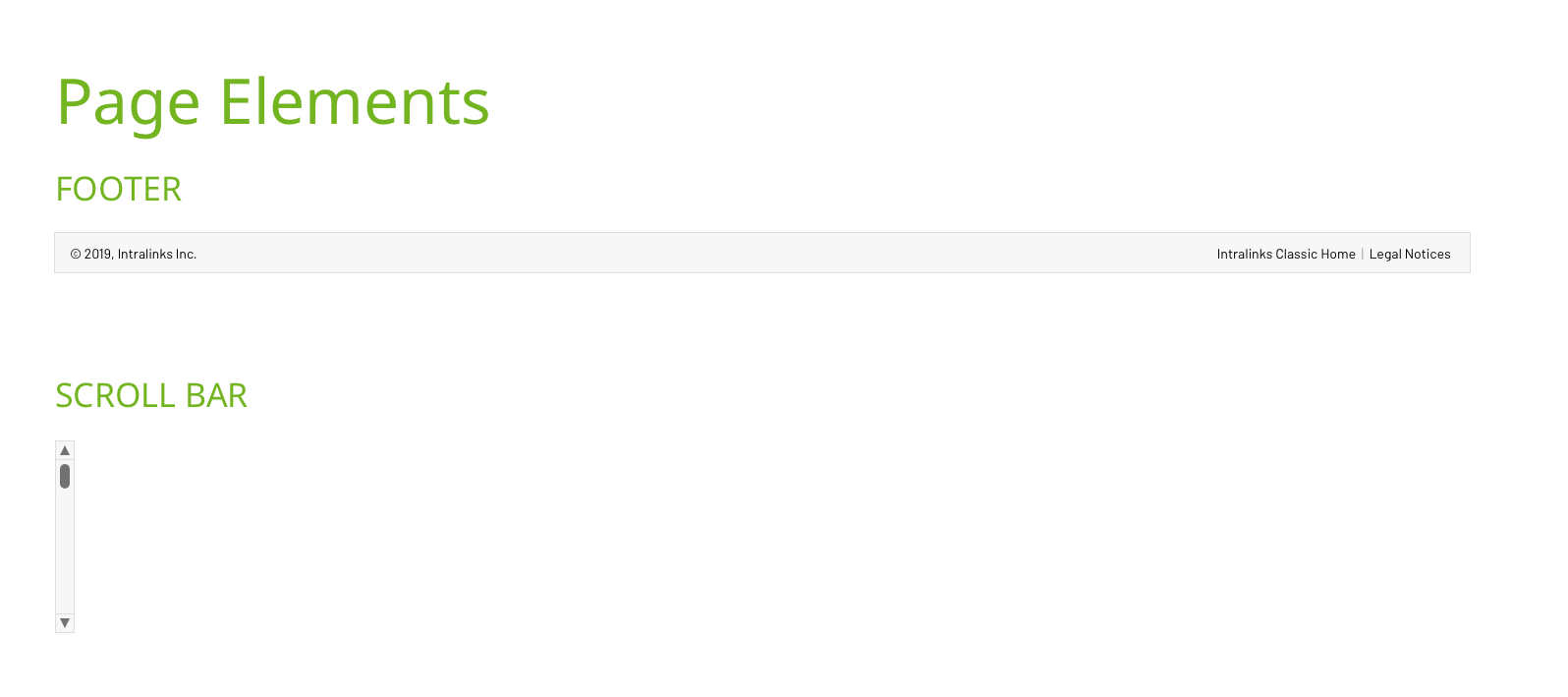
Acquisition / Re-brand
Intralinks' first acquisition by Synchronoss prompted a re-brand from the Marketing department. Like so often is the case, the guidelines reflected colors, image usage and layout for marketing collateral.
Digital "Guidelines"
References to the "digital" side included ads, e-bulletins and the (marketing, .com) website.
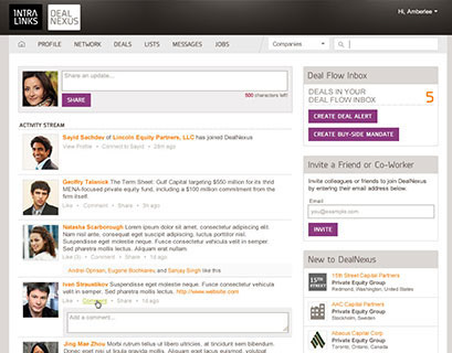
But how did this apply to our web-based, SASS products?
Brand Guidelines missing *product* guidance
What traditional brand guidelines miss:
• Color use that provides easy readability and contrast, especially for accessibility
• Font usage and scalability depending on a large variety of viewports
• Page layout and responsiveness for large variety of viewports
• Interaction and design patterns for web-based products or other channels including desktop, native mobile or devices
• Guidance for native mobile apps: fonts, colors, app icons, leveraging native OS patterns and interactions
Brand should be reflected across all channels
My past work in Marketing departments gave me a strong appreciation for brand cohesiveness across all channels of a business--it instills trust, integrity and competence to a brand. But what happens when Marketing and Product aren't collaborating? I took it upon myself to explore how the new brand could be applied to our web-based SASS products.
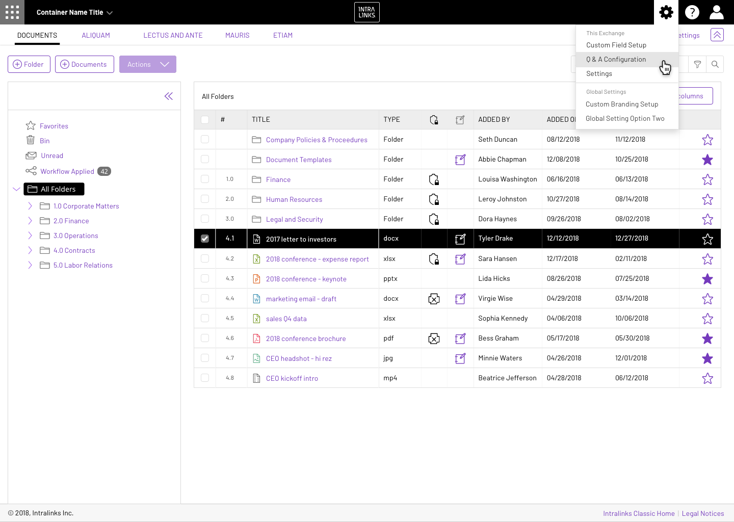
Concept 1: Data Grid
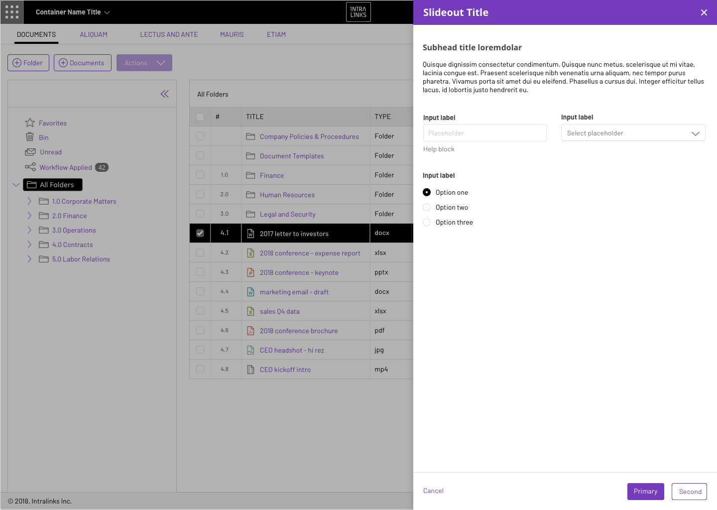
Concept 1: Data Grid with Slideout
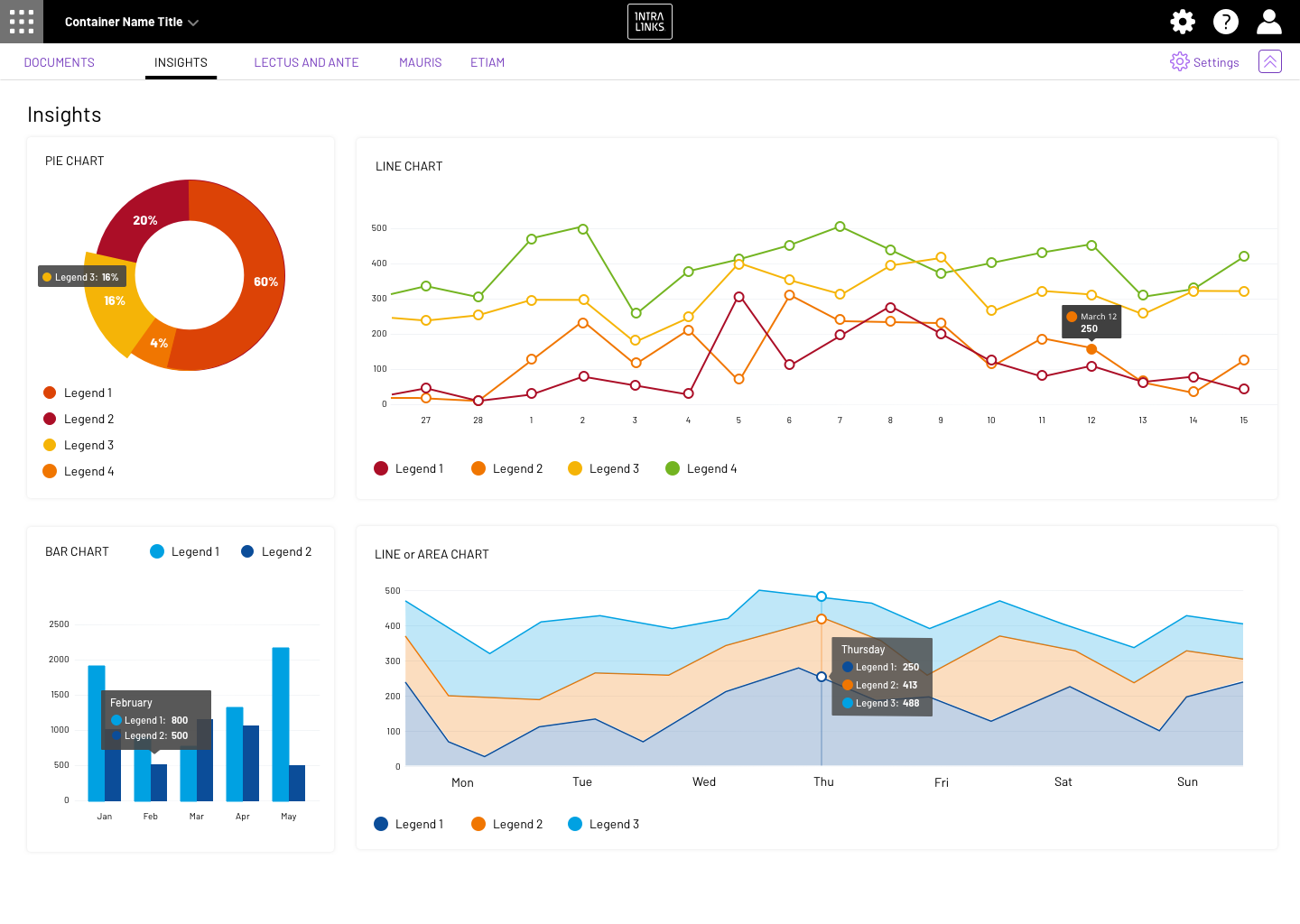
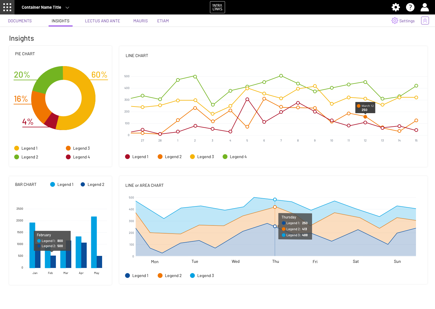
Concept 1: Data Viz
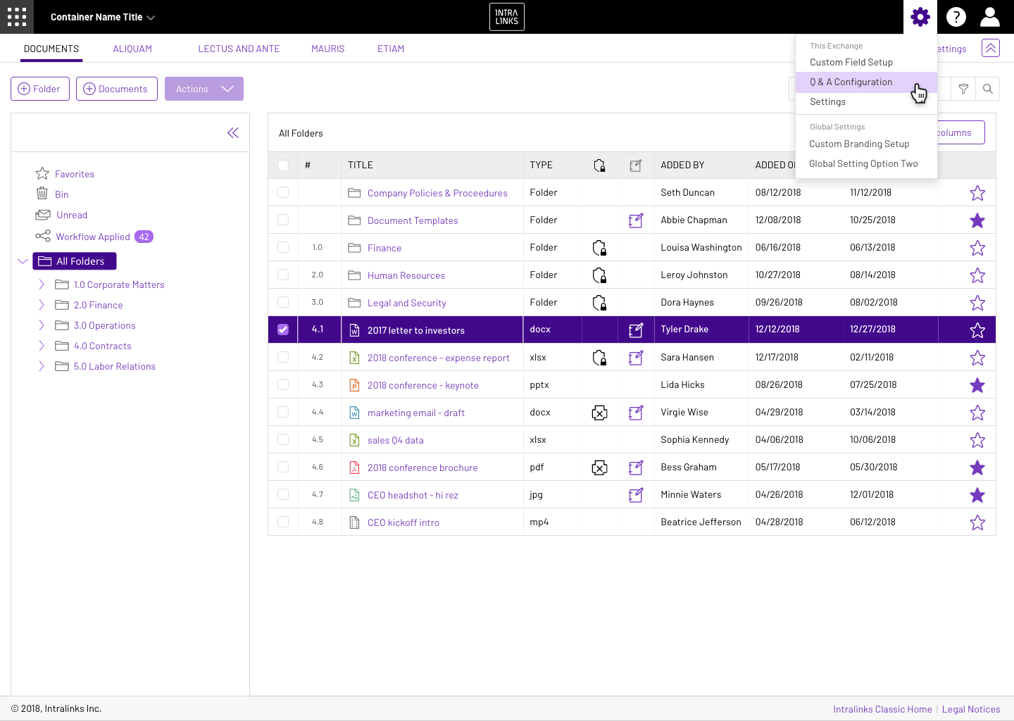
Concept 2: Data Grid
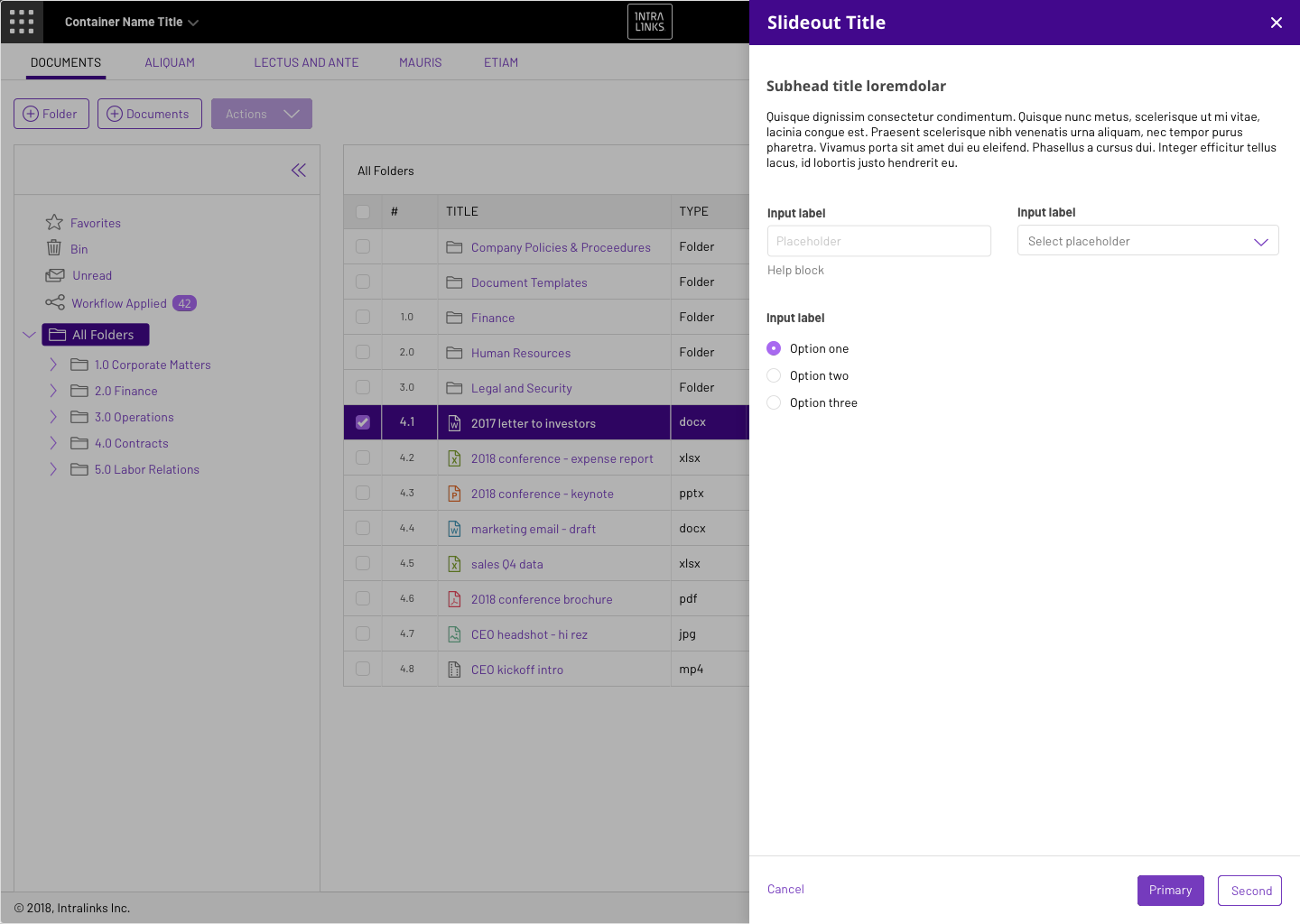
Concept 2: Data Grid with Slideout
Concept 2: Data Viz
Concept 3: Data Grid (using secondary pallette for highlight and selected states)
Concept 4: Data Grid - combing old (blue) and new brand (purple)
Concept 2: Data Grid (v2)
Concept 2: Data Viz (v2)
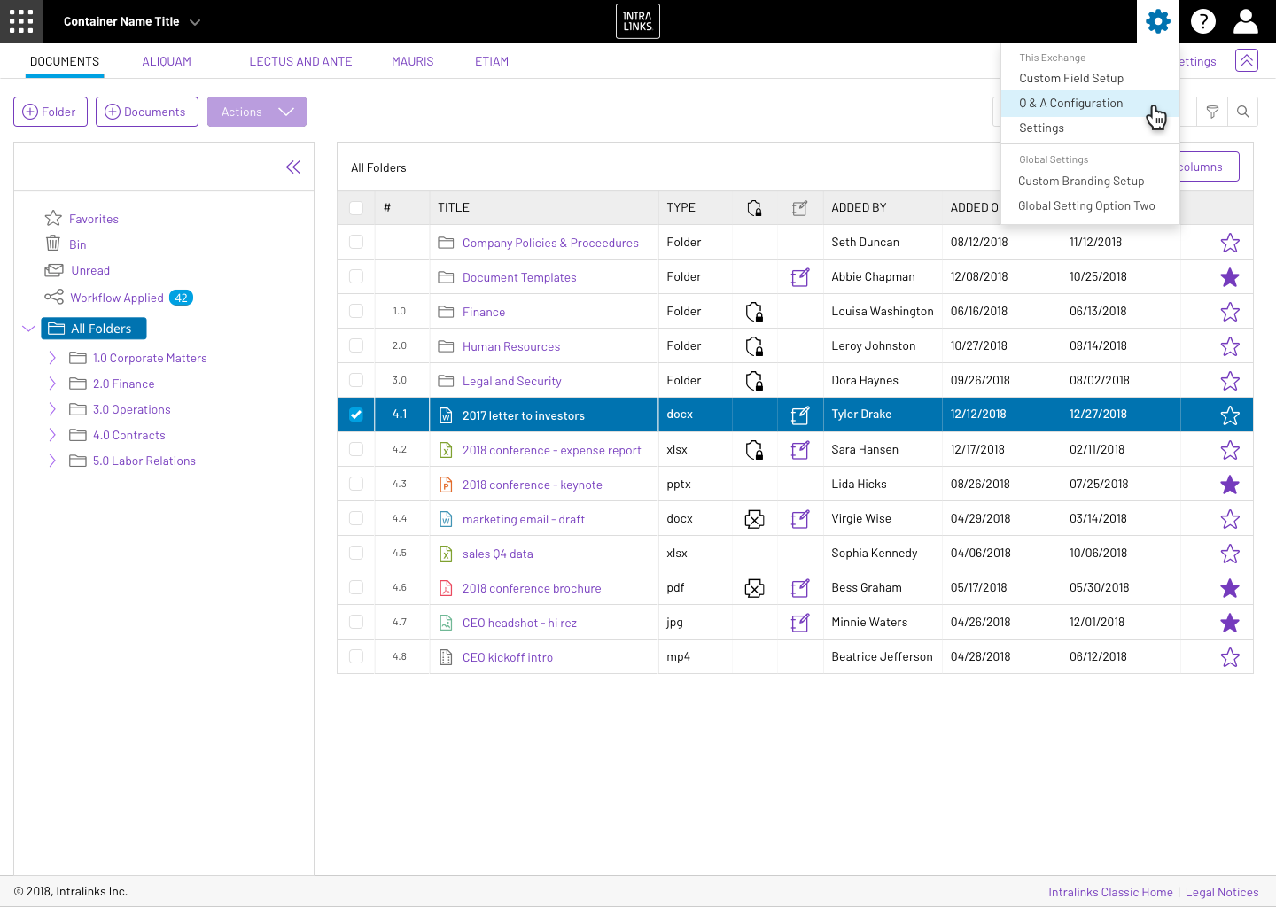
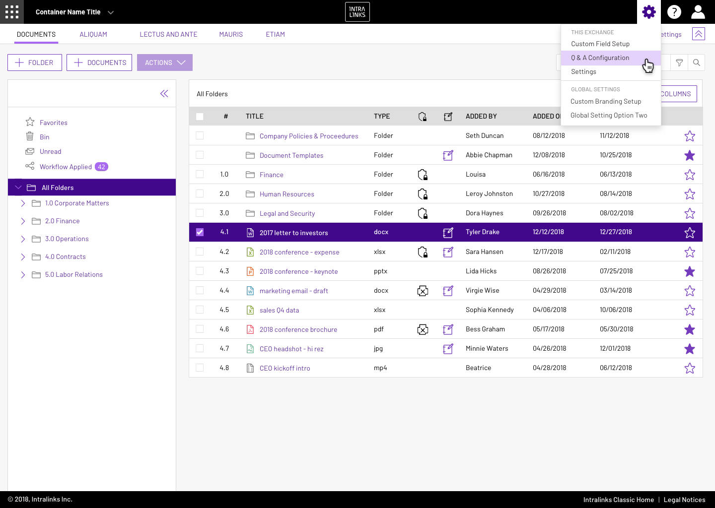
How should Theming be applied to the interface?
In addition, Intralinks allowed it's customers to "custom theme" it's products, yet the current product suite has not standardized on how those themes should be applied. (Refer to related project, Theming / Custom Branding, to understand how themes are created and applied)
Intralinks
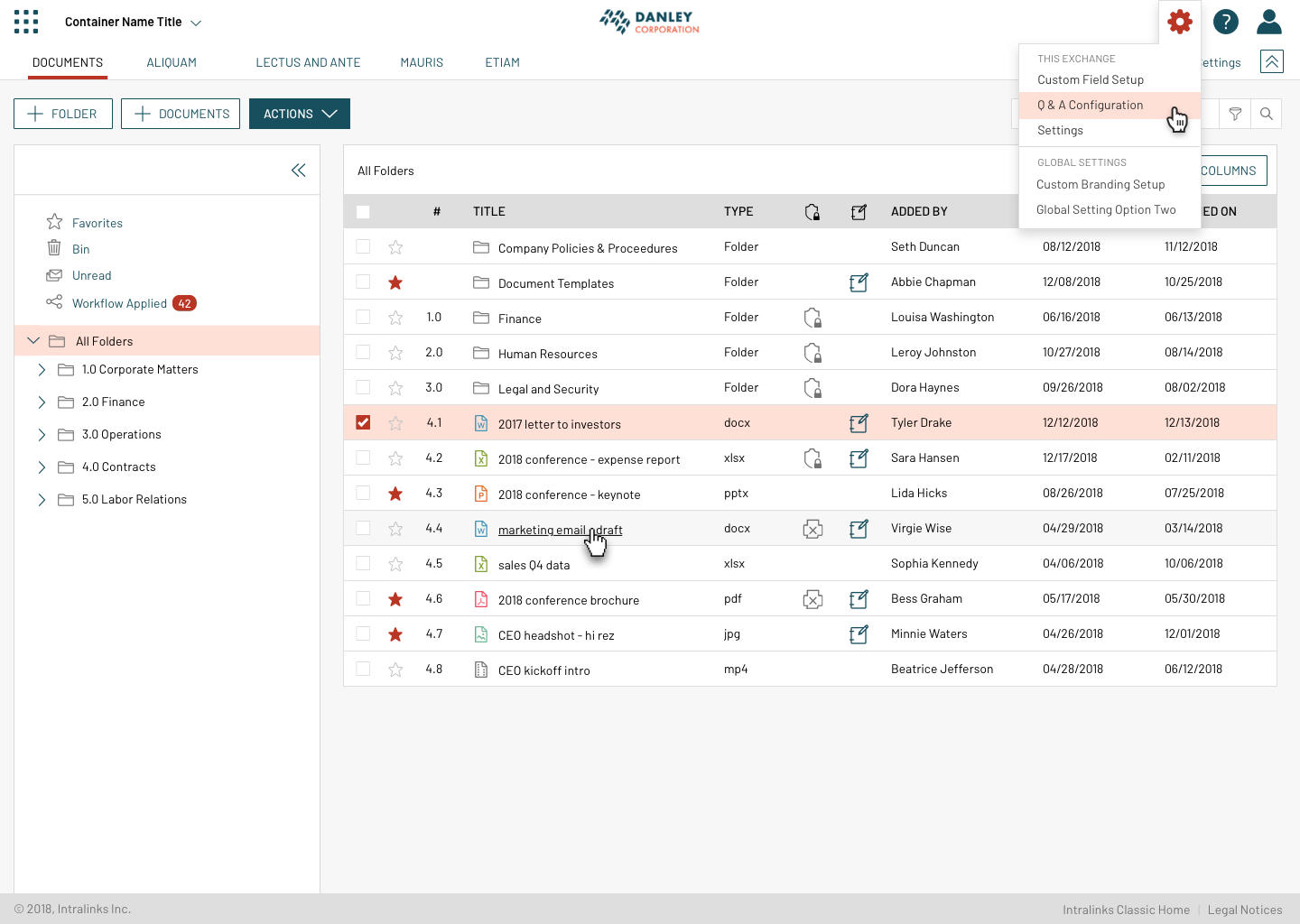
Custom Theme 1
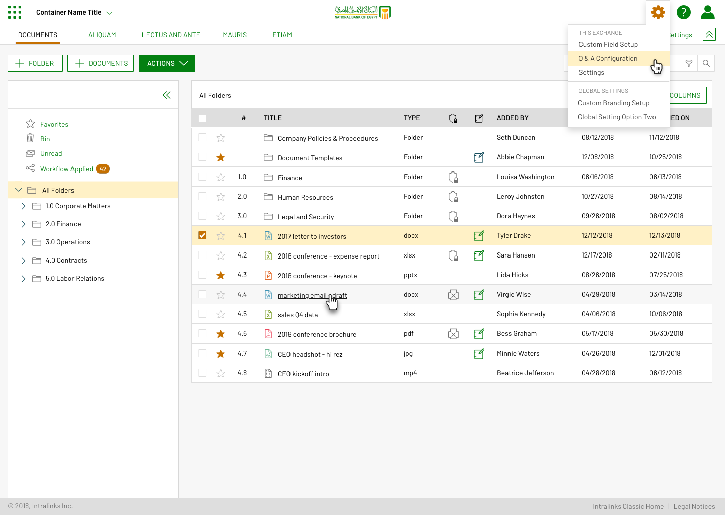
Custom Theme 2
Documentation of how to implement
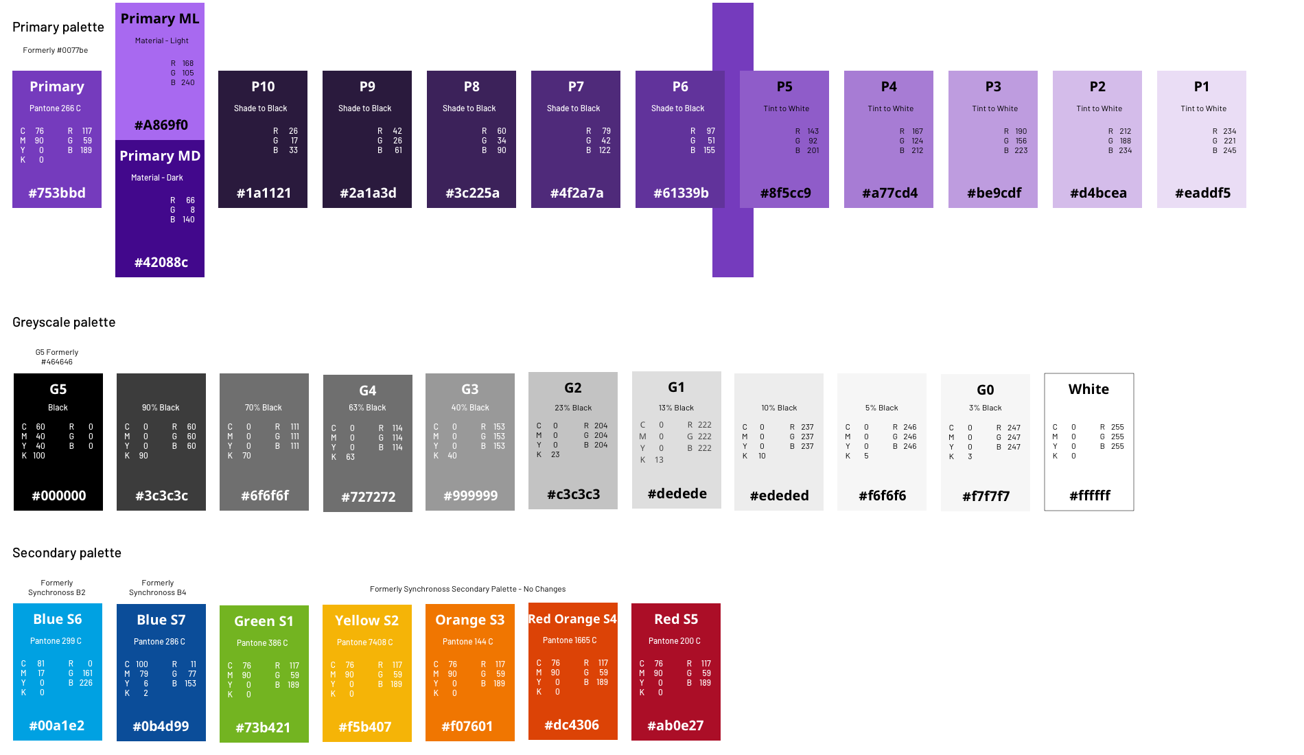
Tints and shades of brand primary (purple) and secondary (black) colors would be needed to apply to various aspects of the interface.
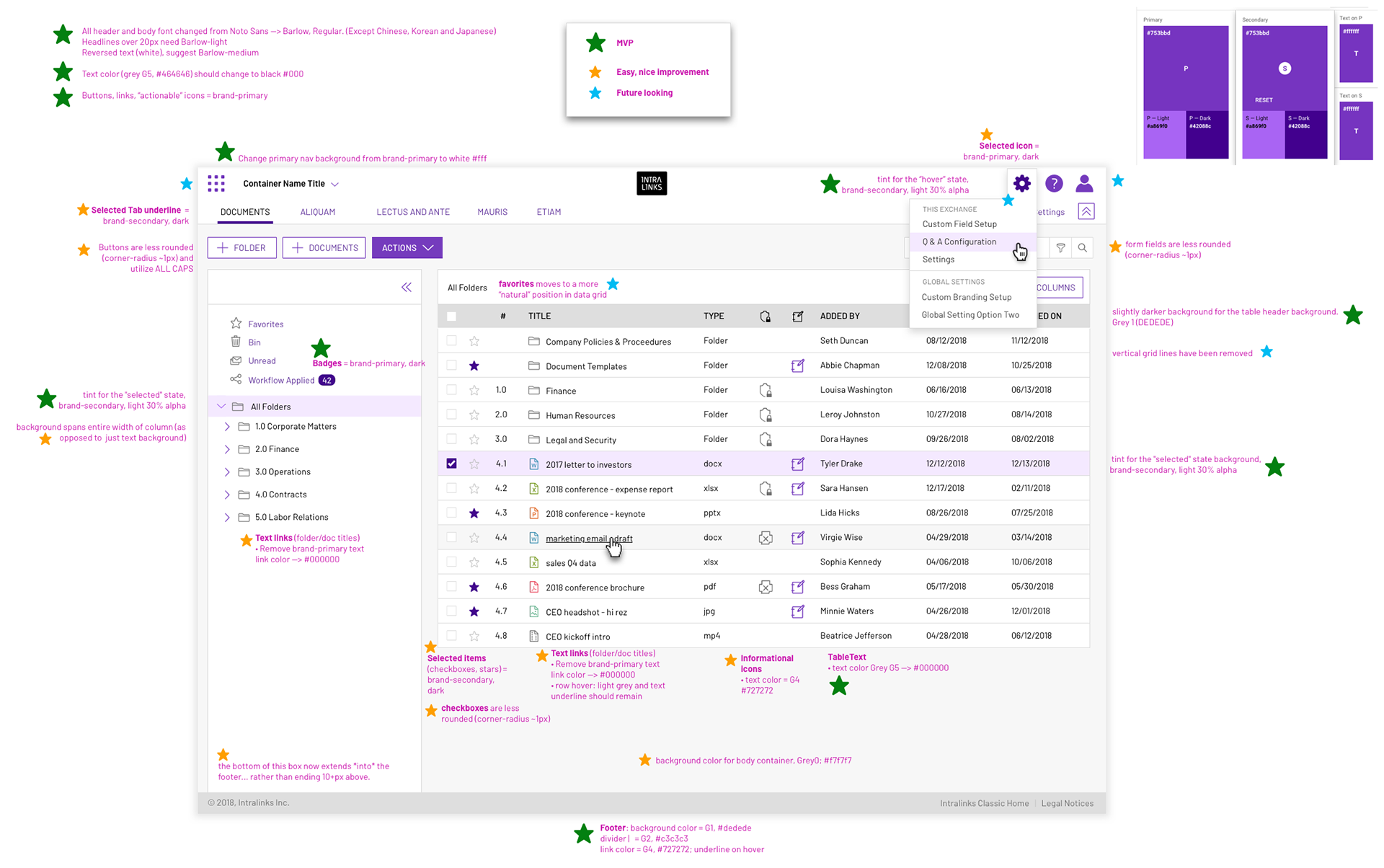
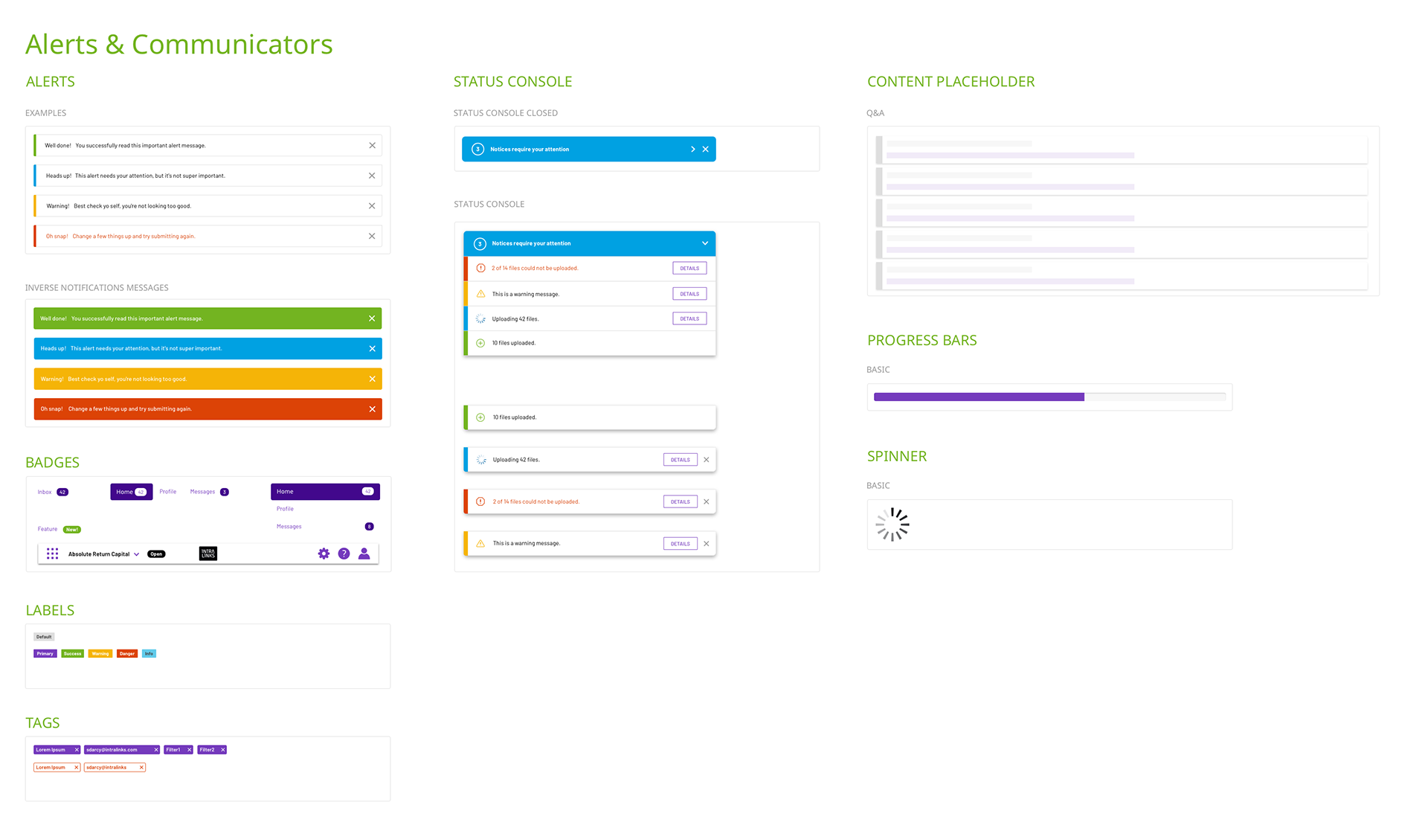
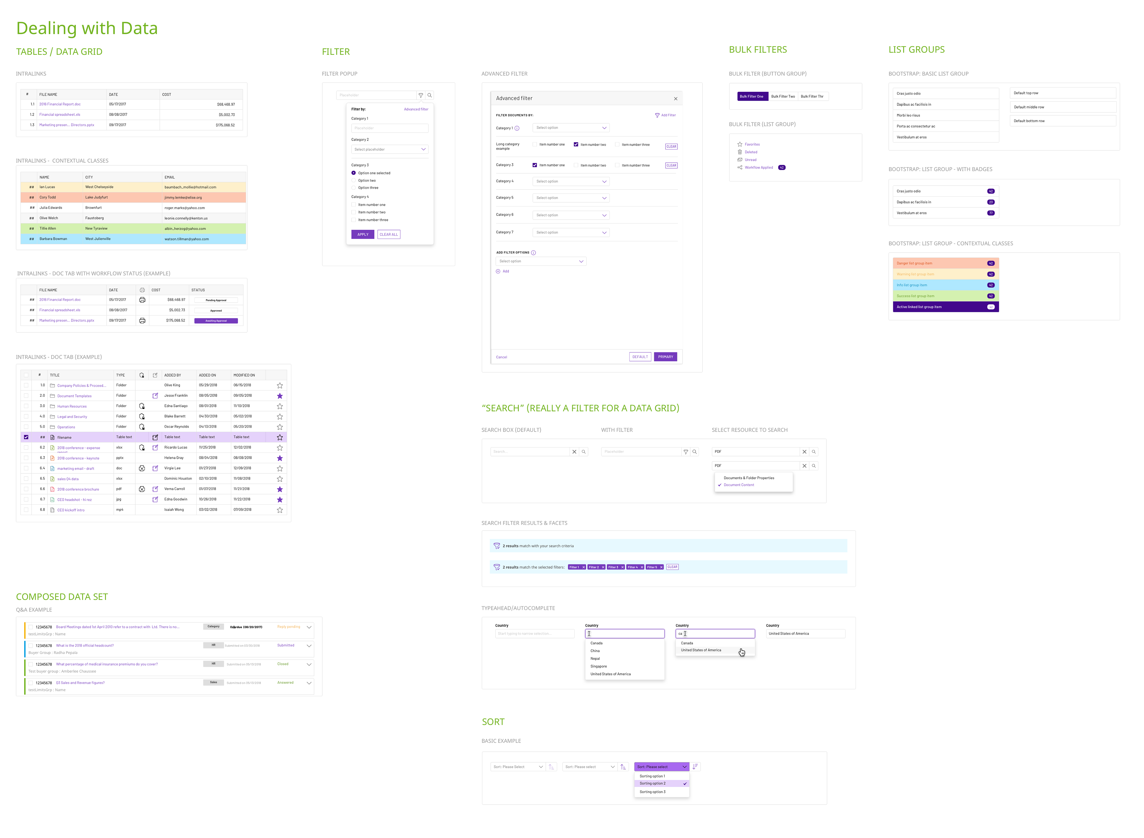
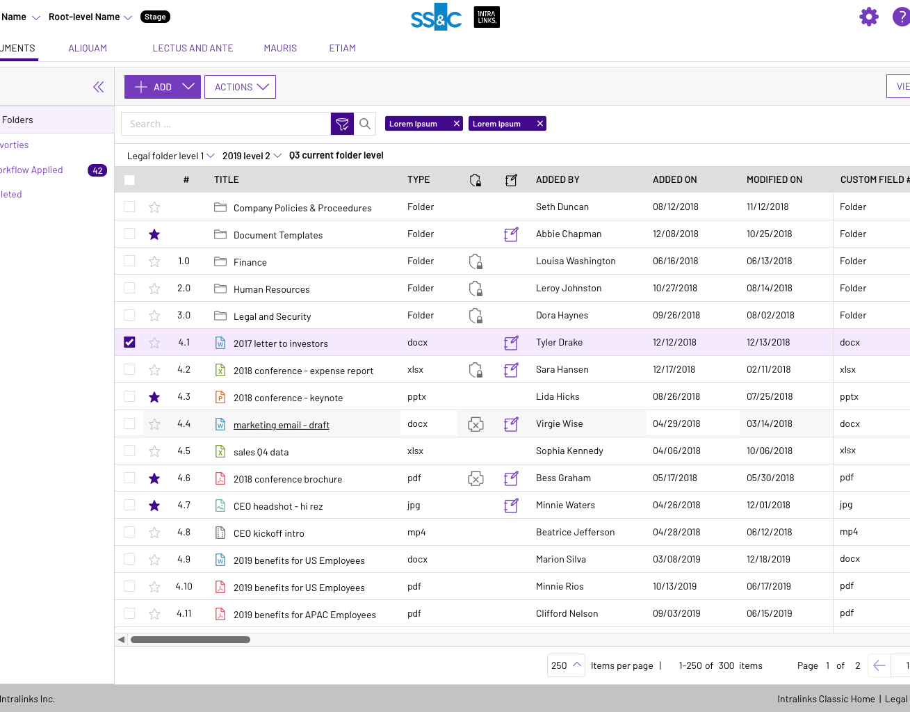
Datagrids account for 80% of Intralinks product screens and interaction, so it's important to get this right!
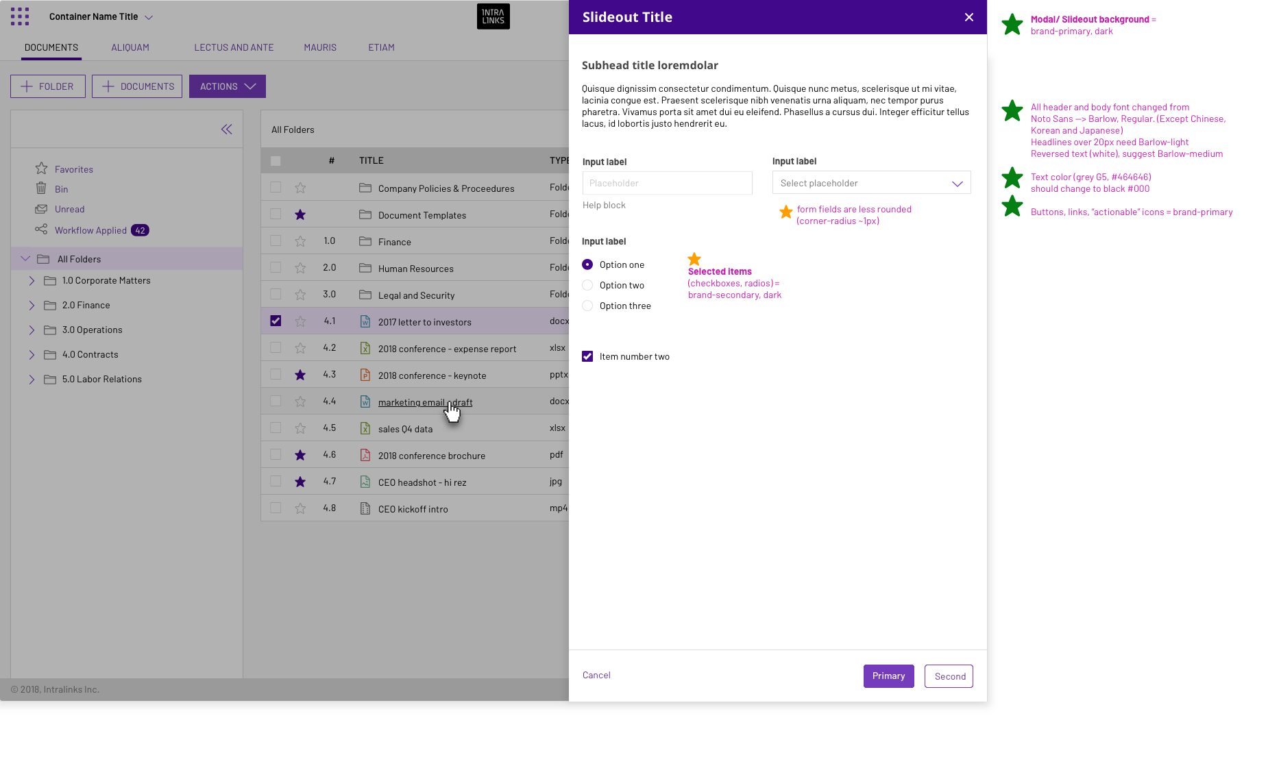
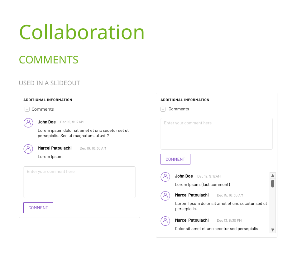
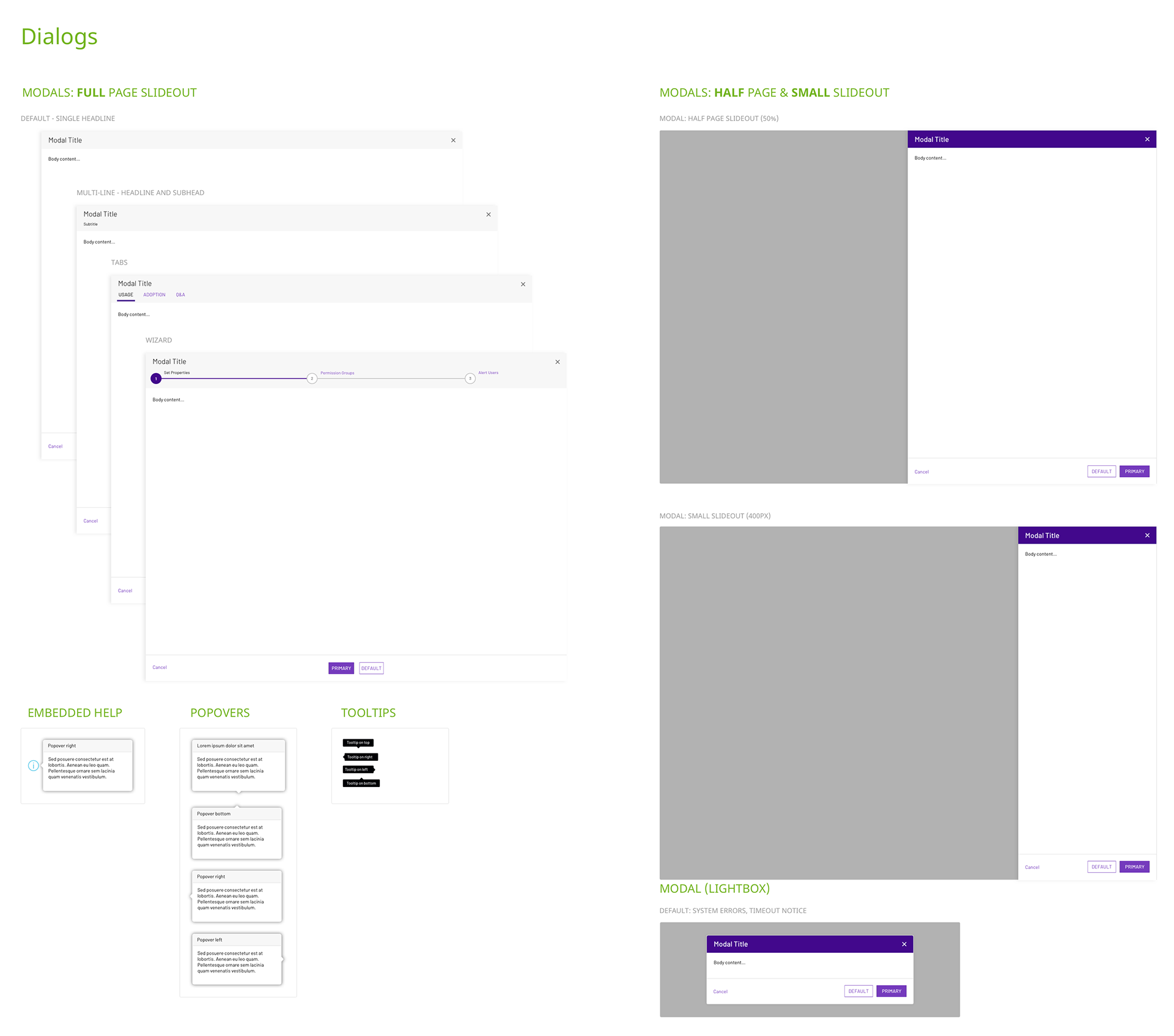
The majority of datagrid interactions utilized slideouts to review additional information or focus the user on a particular task that must be completed in order to proceed.
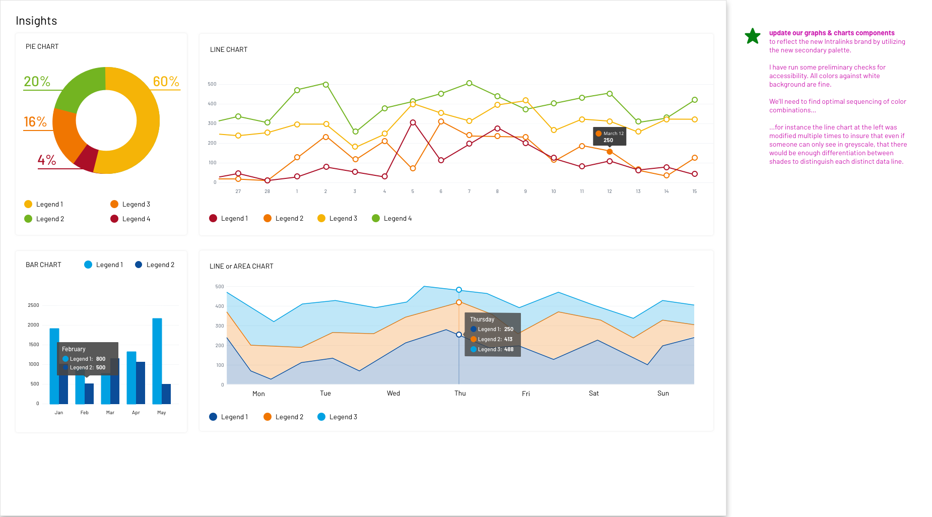
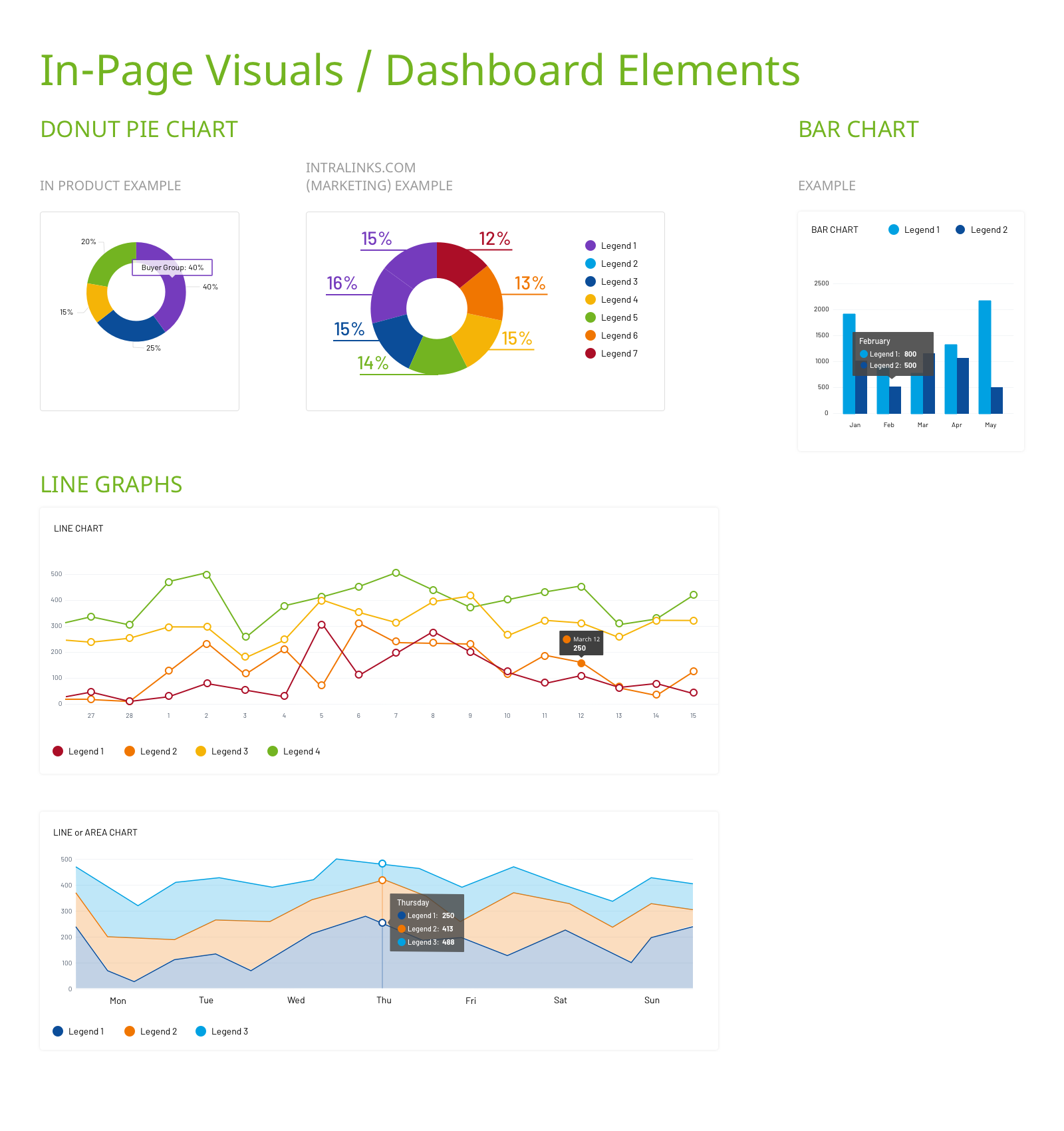
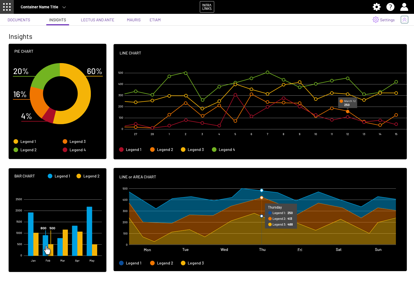
Data Visualization
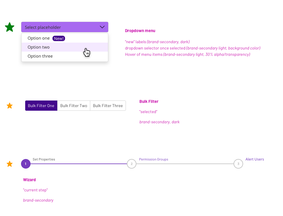
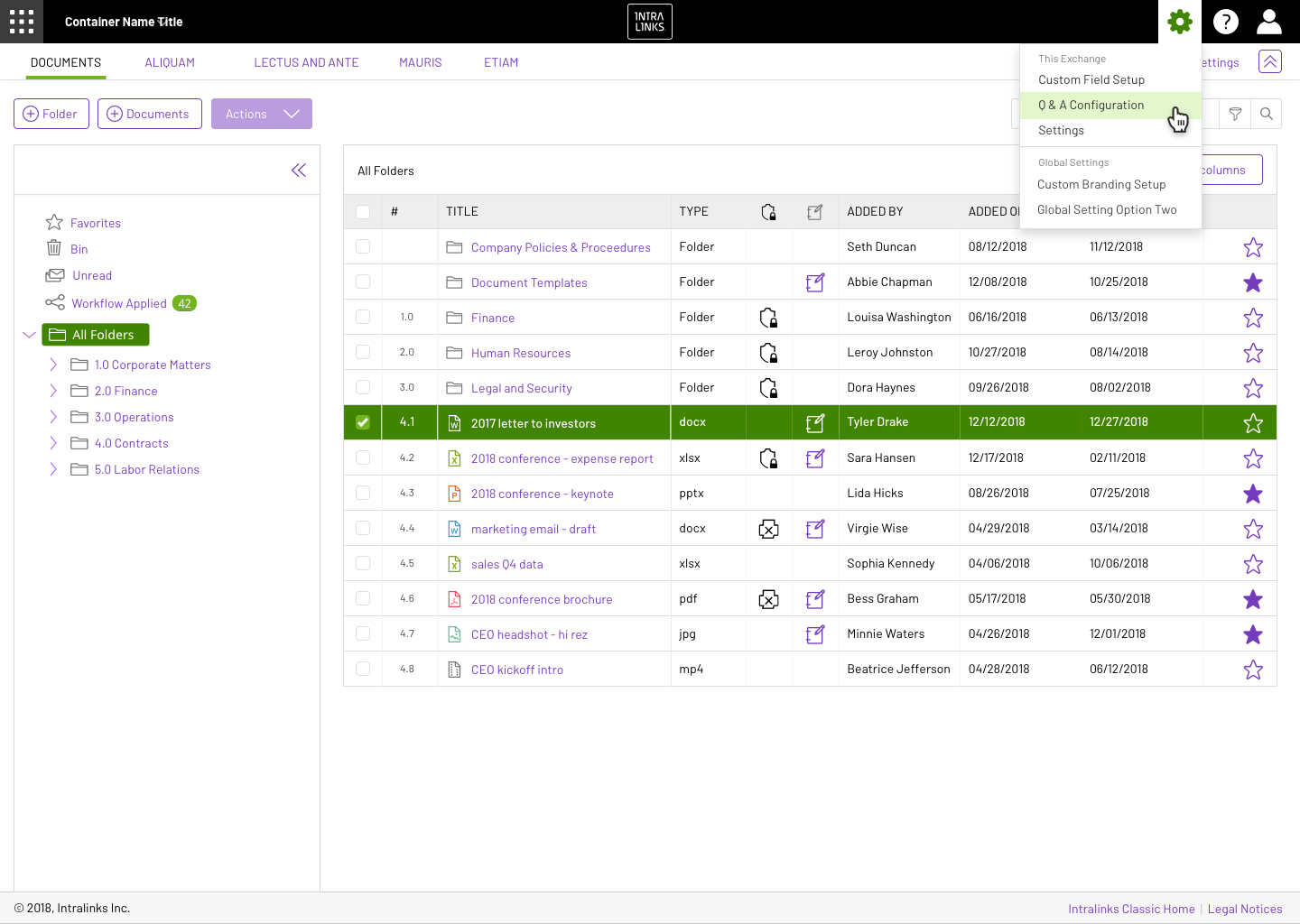
Specific instances of "hover" and "selected" states
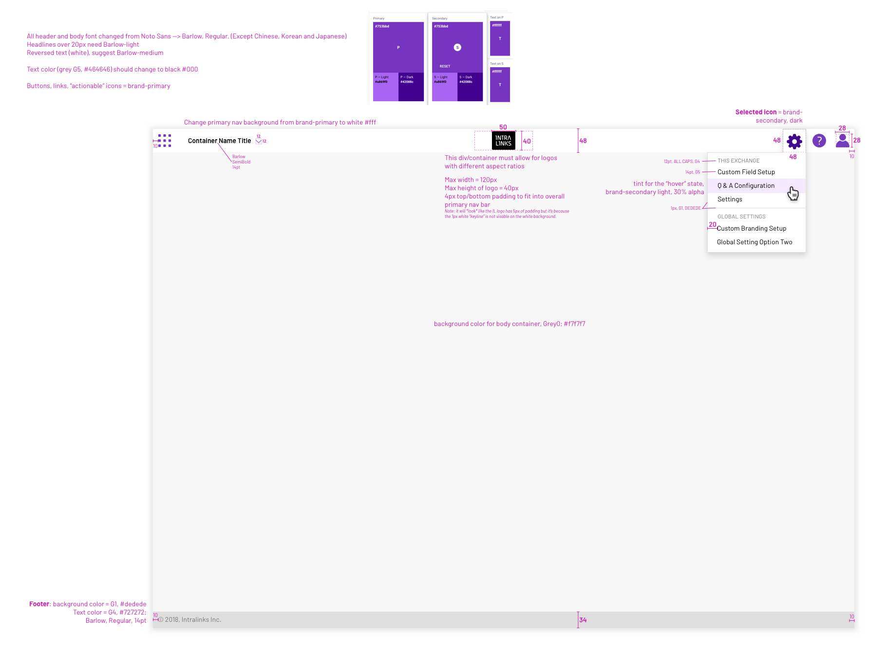
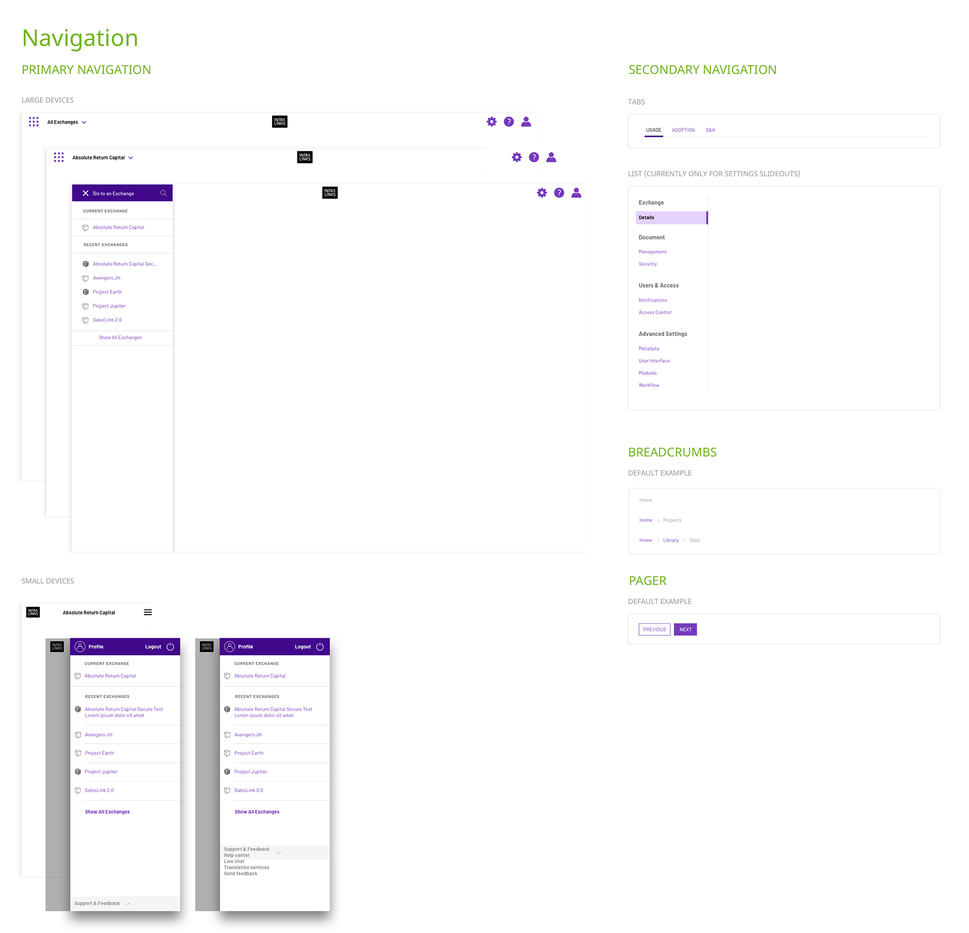
Updating the global header to allow for app switcher, custom theming and global level settings...all things that were not previously accounted for
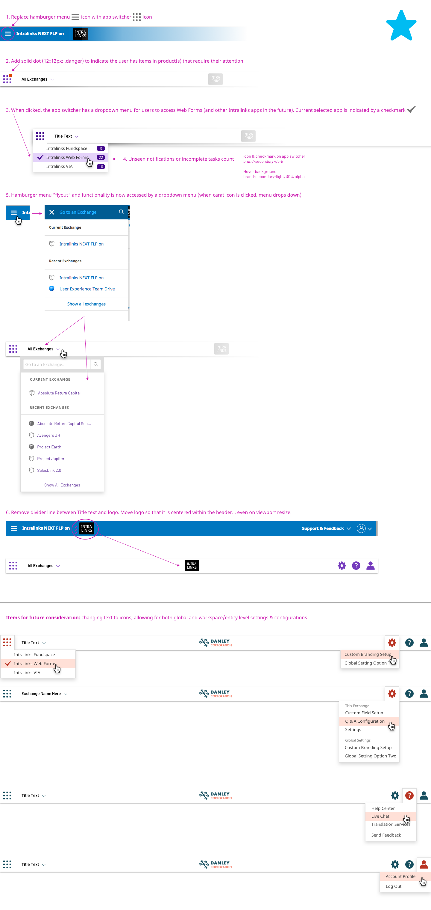
Specific steps to update the current primary nav to the new concept
Phases to Implement
It's unrealistic to think that a large product organization with a range of products can stop everything and dedicate their full attention to a re-brand across their entire product suite. The following is my suggested guidance on how to break up the re-brand into 3 stages--addressing the broadest, most impactful changes first and then scheduling in later items to make the brand more robust. (this prioritization can be seen in the documentation above with the colored stars. green = MVP; gold = nice to have; blue = future-looking.
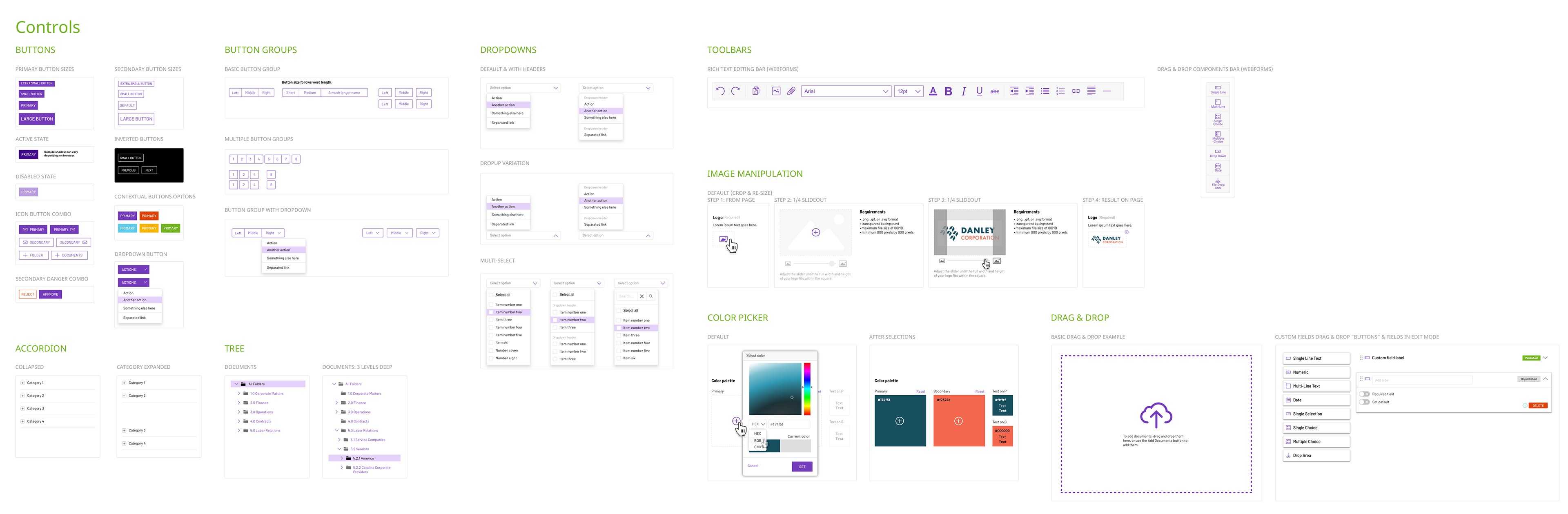
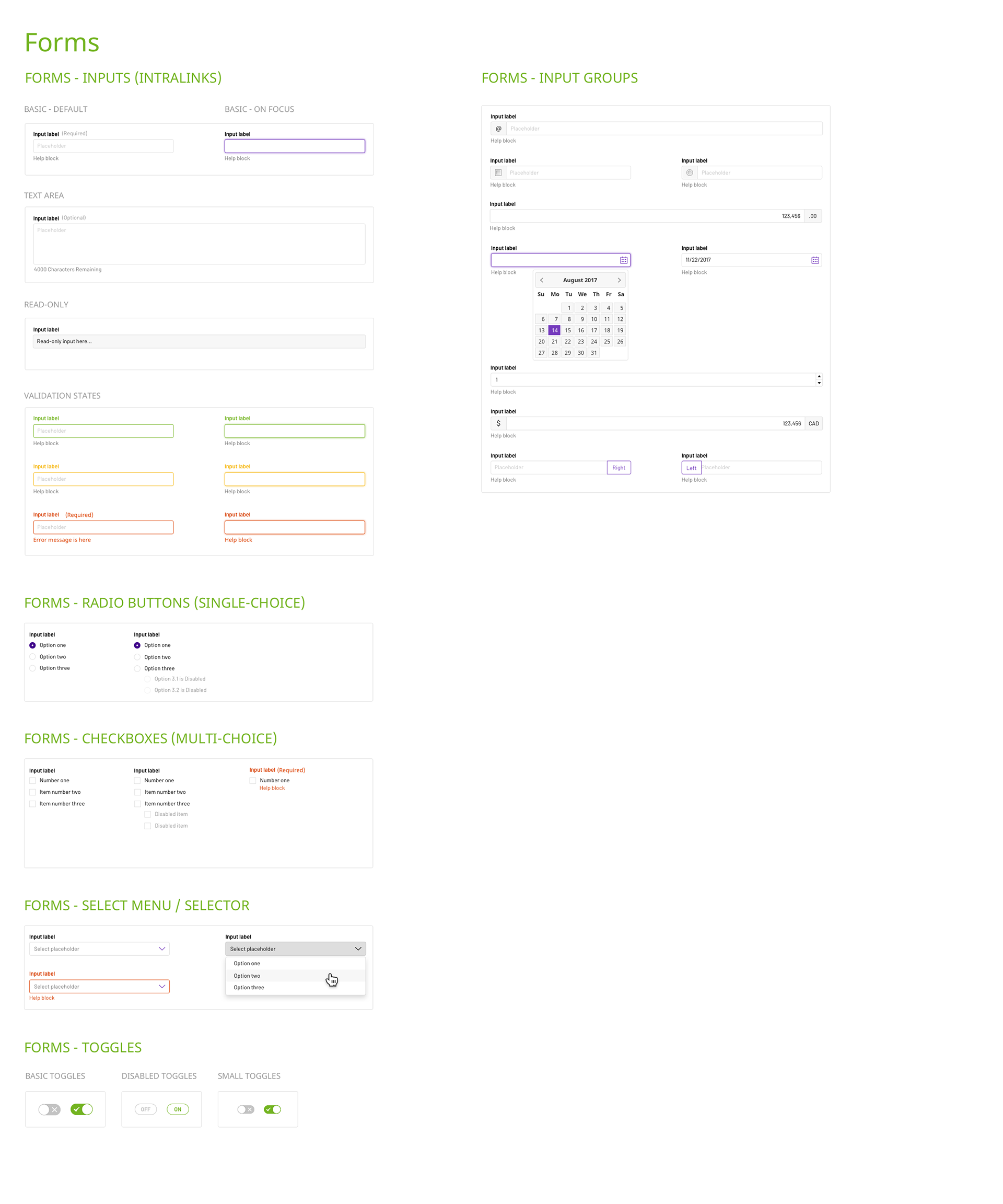
Toolkit for designers
To aid designers in quickly adopting the new brand into their respective projects, I updated the Designer GUI Toolkit (Sketch file and respective symbols) to reflect the new Intralinks brand with custom theming logic applied to entire spectrum of components.