Goal & Use cases to address
In the Fund Reporting space of Alternative Investments, important documents are sent out by fund managers to their documents. It is important for fund managers to be able to quickly see:
• Groups or individuals who have NOT ACCESSED a document so the fund manager can follow up and ensure the document has been read.
• Groups or individuals who HAVE ACCESSED a document (good indication of most engaged clients)
• Groups or individuals who DON'T HAVE ACCESS (quickly indicate if view permissions are set correctly)
• Groups or individuals in which the document alert email never arrived (alert error) so fund manager can follow up and remedy why email failed (incorrect email, user no longer with company, etc.)
Technical issues to address
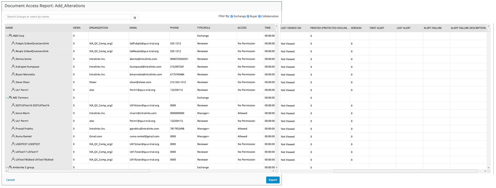
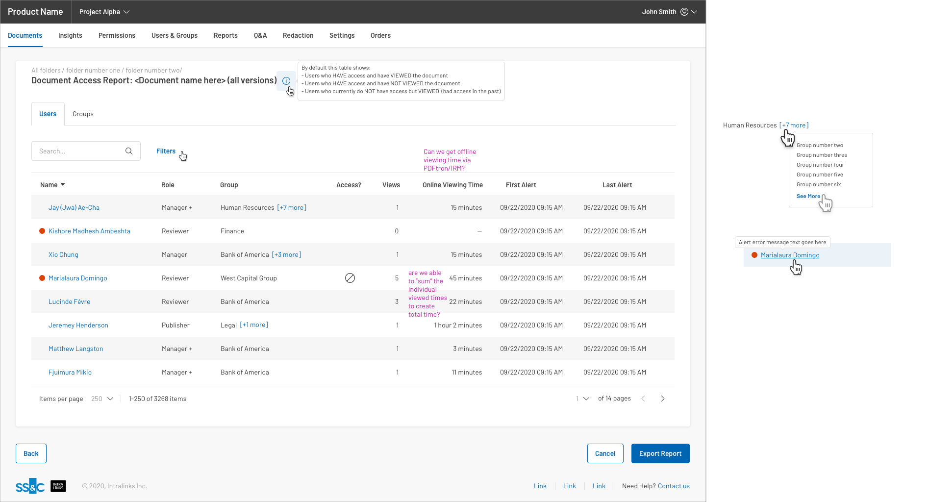
• Original report was huge and very slow to load because it grabbed data for all users within the project; especially users who didn't even have access to the document.
• Users who were in more than one group would show up multiple times in the report.
• The report contained many unnecessary fields that didn't add value for the end user like phone number and organization.
• The fields shown based on if the user had selected a single document or multiple documents for the report were different.
• Some fields were not even supported by the platform like versioning and time viewing document.
Migrating to a new design system
As is often the case, this project was a priority for the business, so the design cycles went through to prepare it for development. In the two months awaiting Engineering capacity for implementation, new standards were put into place for all net-new designs to adopt the v2.0 of the design system patterns, look and feel.
Shown below is the the project in the former design system (version 8). This project had already gone through the following steps of the Design Lifecycle:
• Business requirements gathering and refinement with Product Management
• Multiple rounds of low-fidelity wires and review with both project management and internal design reviews.
• High-fidelity wires produced and reviewed with Product Management and Design
• Cross line of business review with both Client Services Managers and Product Owners.
• Design review with entire design team
Design strategies implemented and the benefits
Breaking the report into Tabs
• Allows users to quickly get to the data that addresses the use case they are trying to address.
• Allows the report to load much more quickly since only a smaller sub-set of the entire (original) report was needed.
• Exporting of the report to Excel now only includes items for the current tab and filters applied--quicker download and reduced data overload.
List view on left Details view on Right
• Allows user to choose the context of how they wish to view the data and quickly switch between viewing by group or by individual user
• Details are shown only when item in list is selected thus reducing the cognitive load to the user
• User can quickly up/down arrow through the list to see details quickly
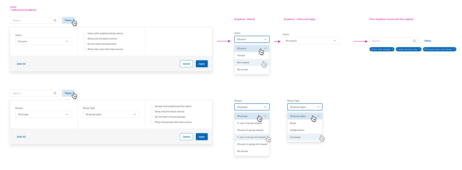
Badges draw users attention to number counts that are important
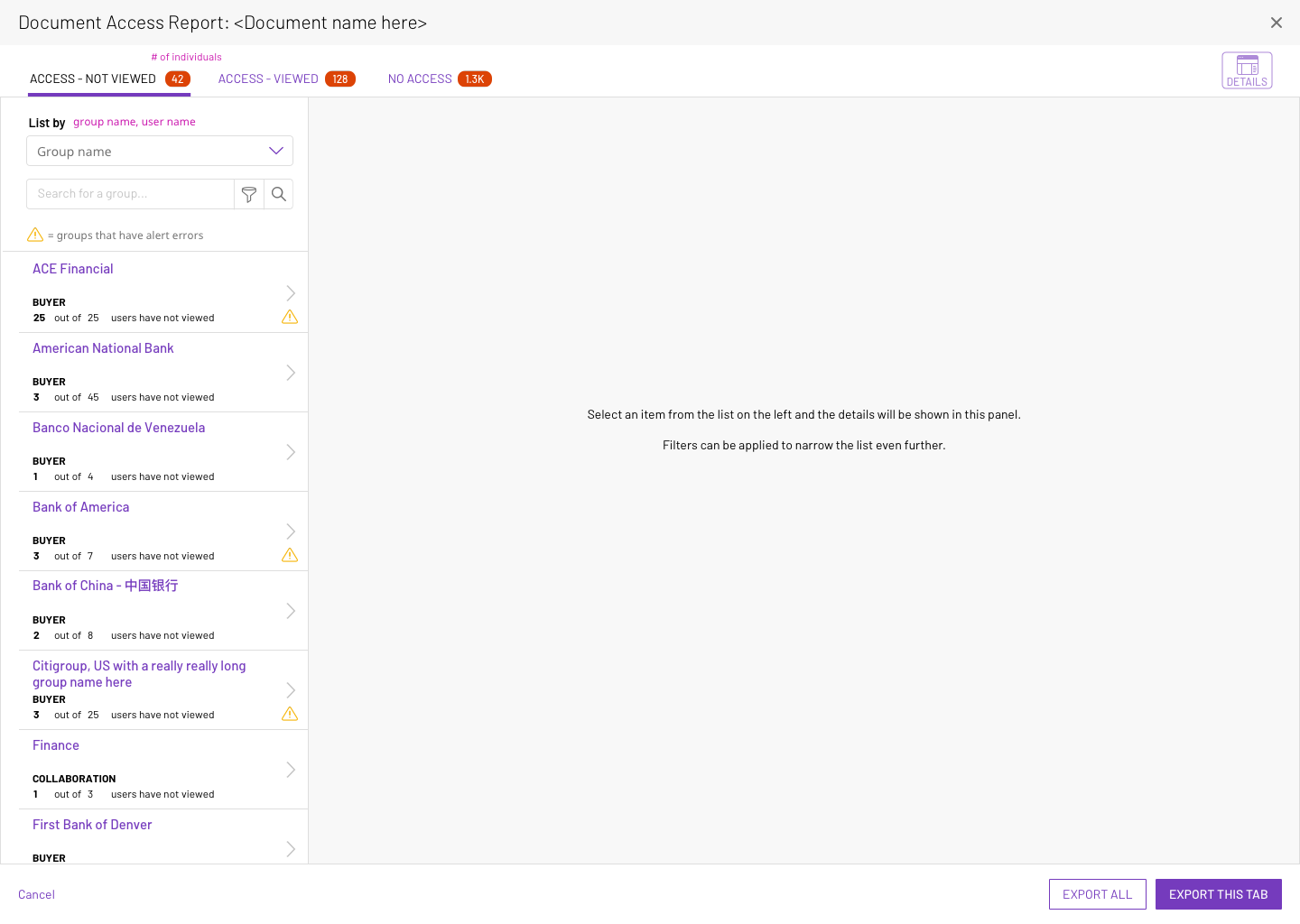
Default View
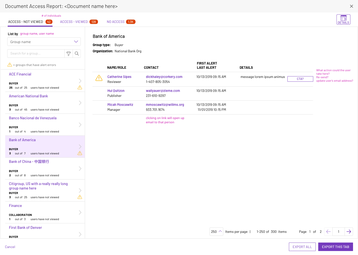
Group selected on the left column. Details of that groups' access are shown on the right.
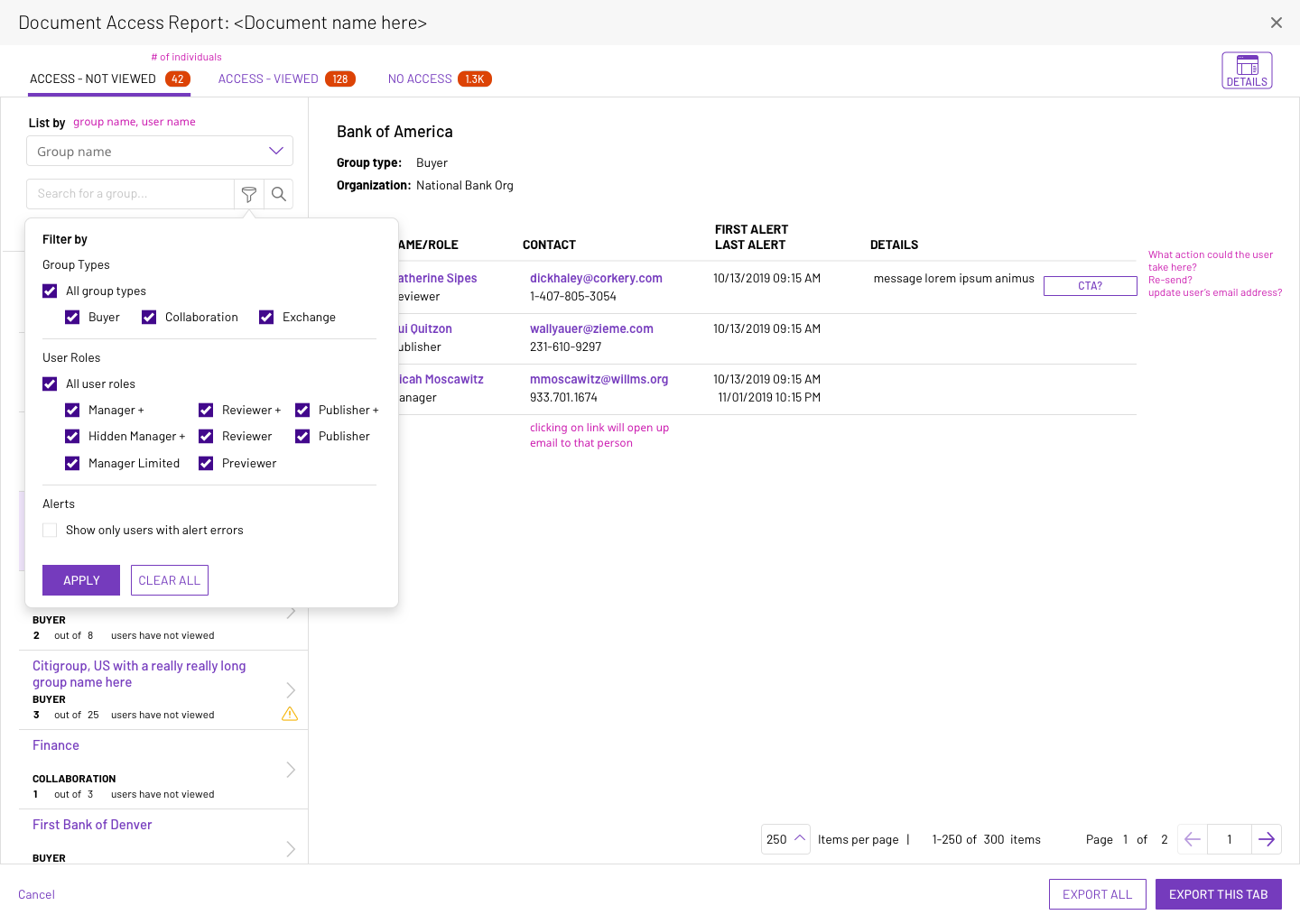
Utilizing the dropdown filter can narrow results within this category further
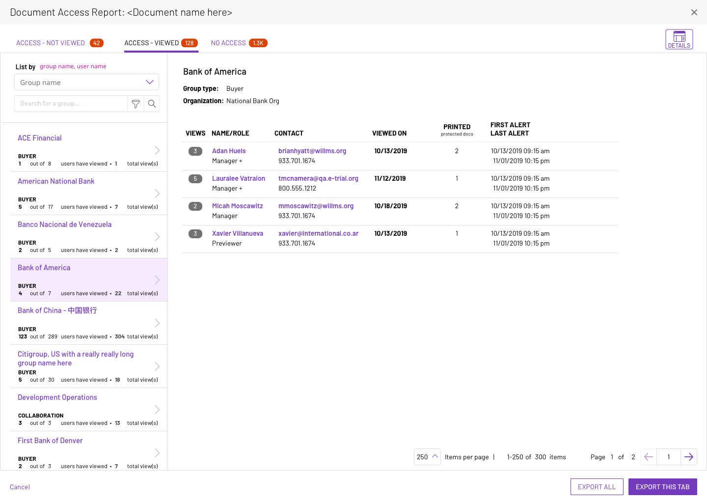
Viewed tab - listed by groups
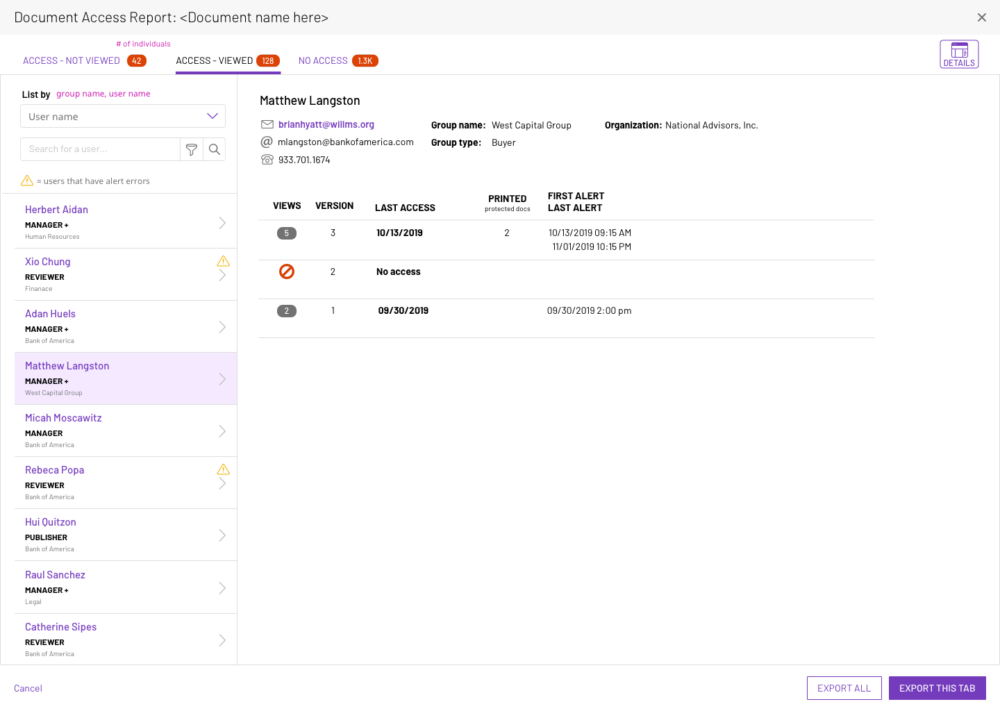
Viewed tab - listed by individuals
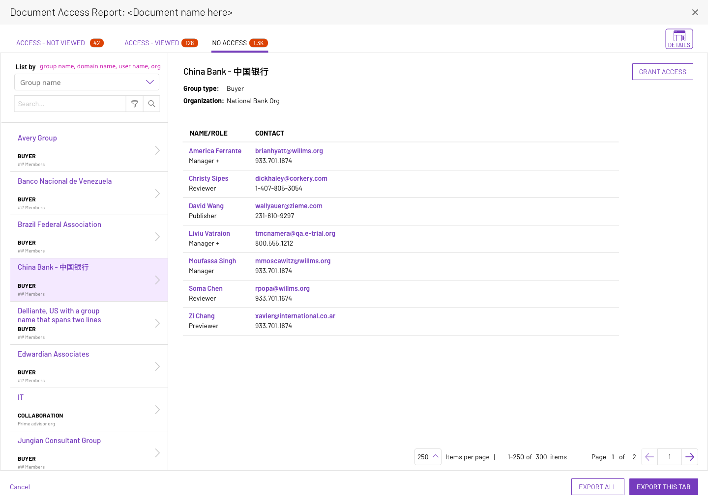
No access
Design with New Design System
This new approach, while visually pleasing, was not, in my opinion, as successful. I tried several times to persuade the design system team for the following reasons:
• While user could change the perspective of the view by utilizing the 'Group' versus 'User' tabs, the ability to quickly get to the user's intended use case (viewed/not viewed; errors, etc) was now hidden behind a filter--not easily discoverable at all!
• New slideout details pane covered over the existing datagrid; user loses access to valuable information.
• Interaction pattern of allowing the user to select line items from the datagrid below the slideout was not natural (I have never seen this interaction pattern in practice in any other product "out in the wild")
• Use of a red dot (instead of a warning icon) might not readily be understandable to users as an error and what that error was for.
Users Tab - Default
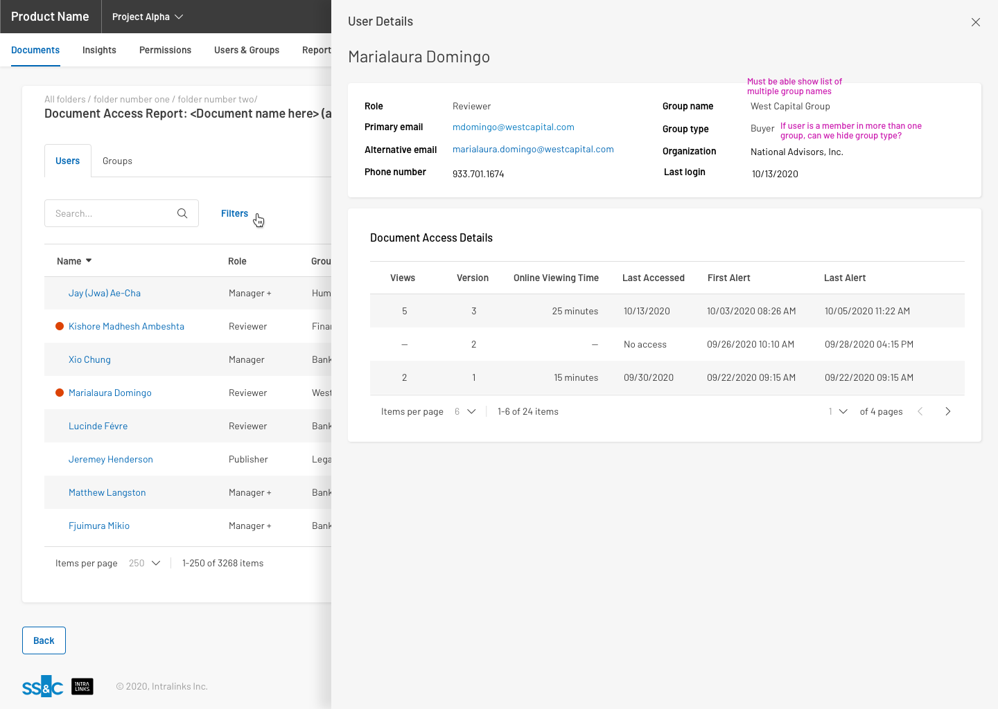
Users Tab - Details - Viewed document
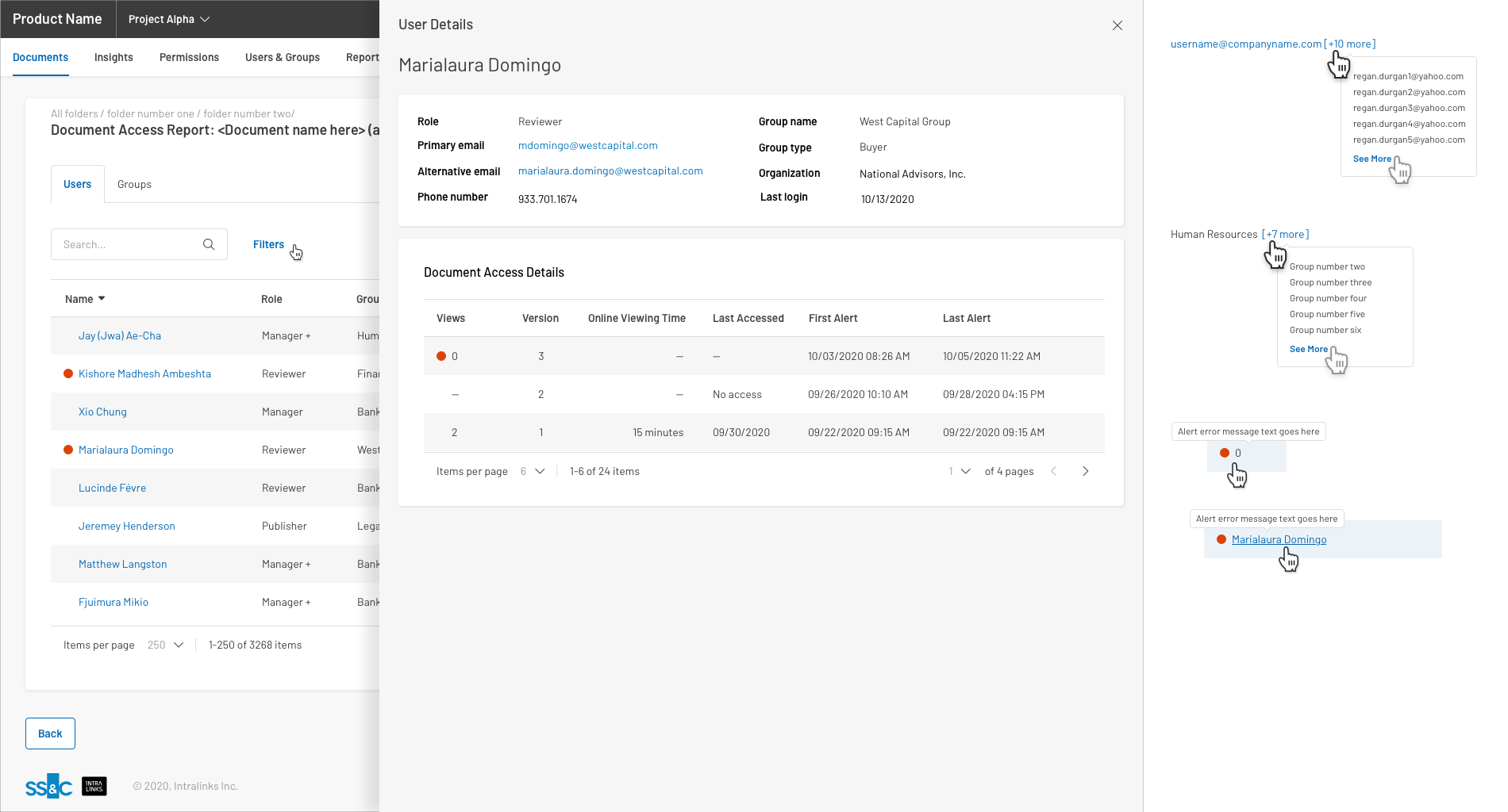
Users Tab - Details - Not Viewed document
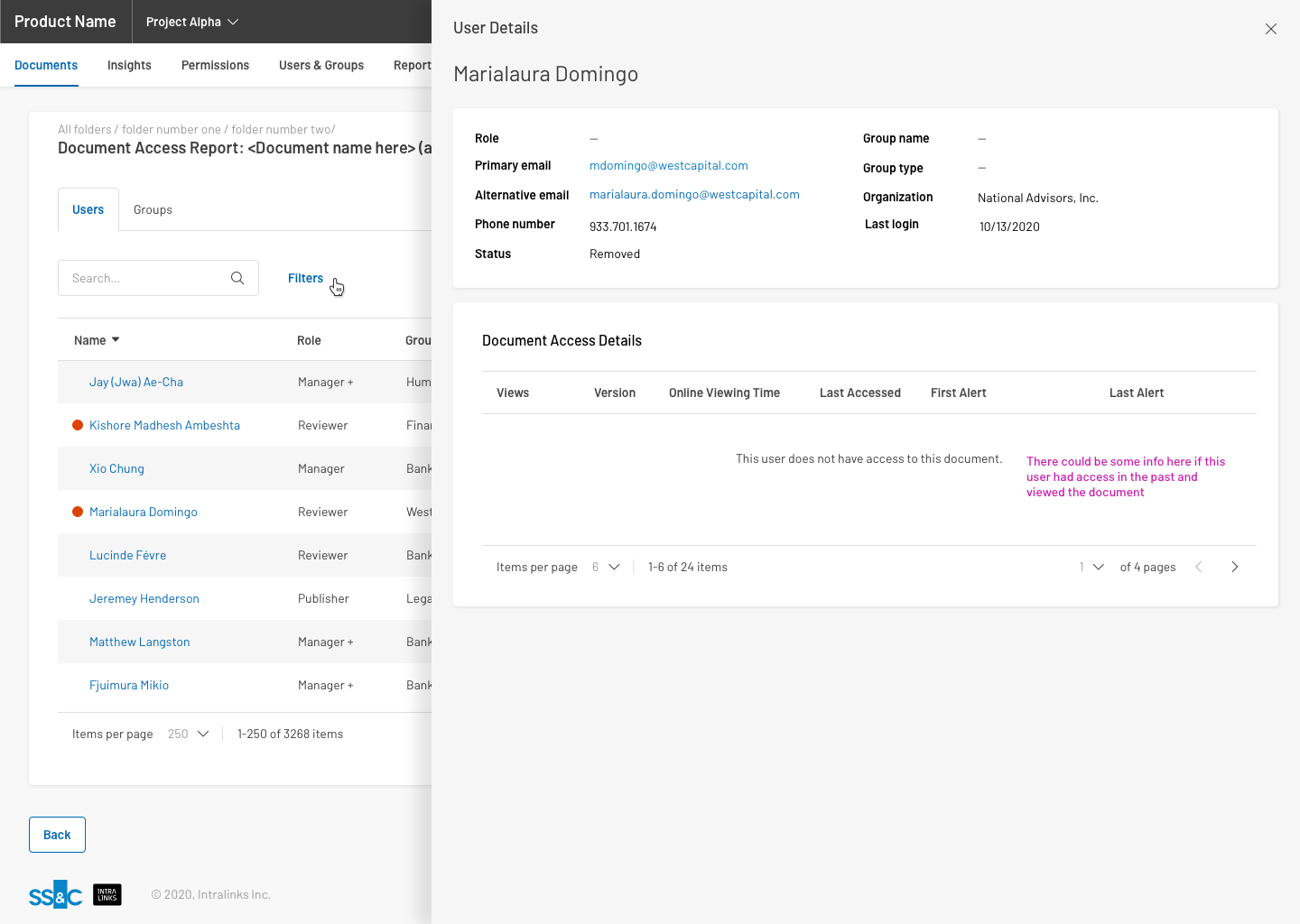
Users Tab - Details - No access to document
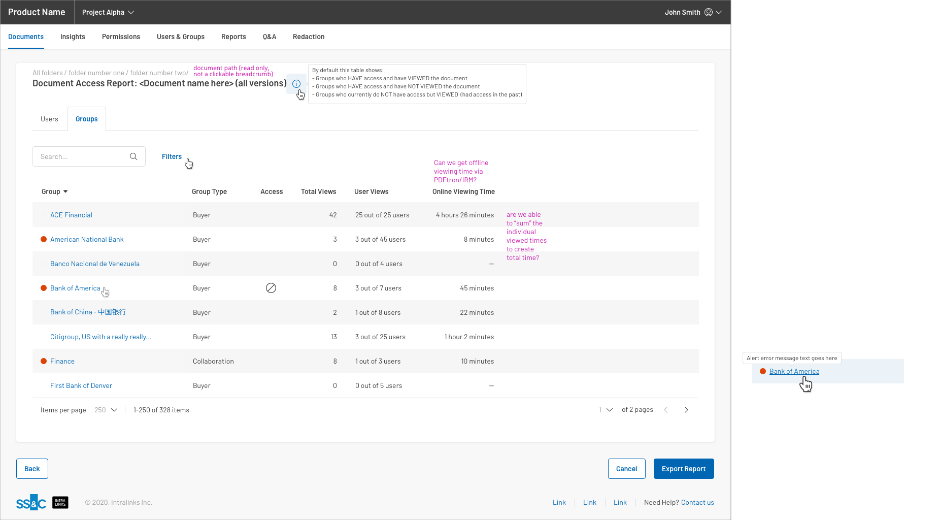
Groups Tab - Default
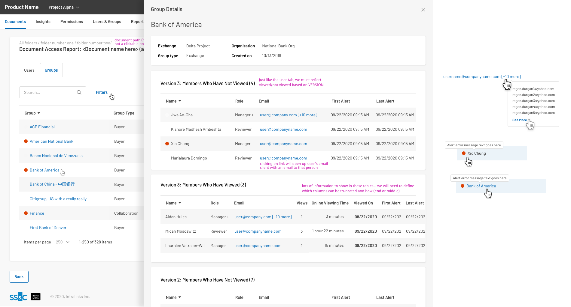
Groups Tab - Details - Both Viewed & Not Viewed
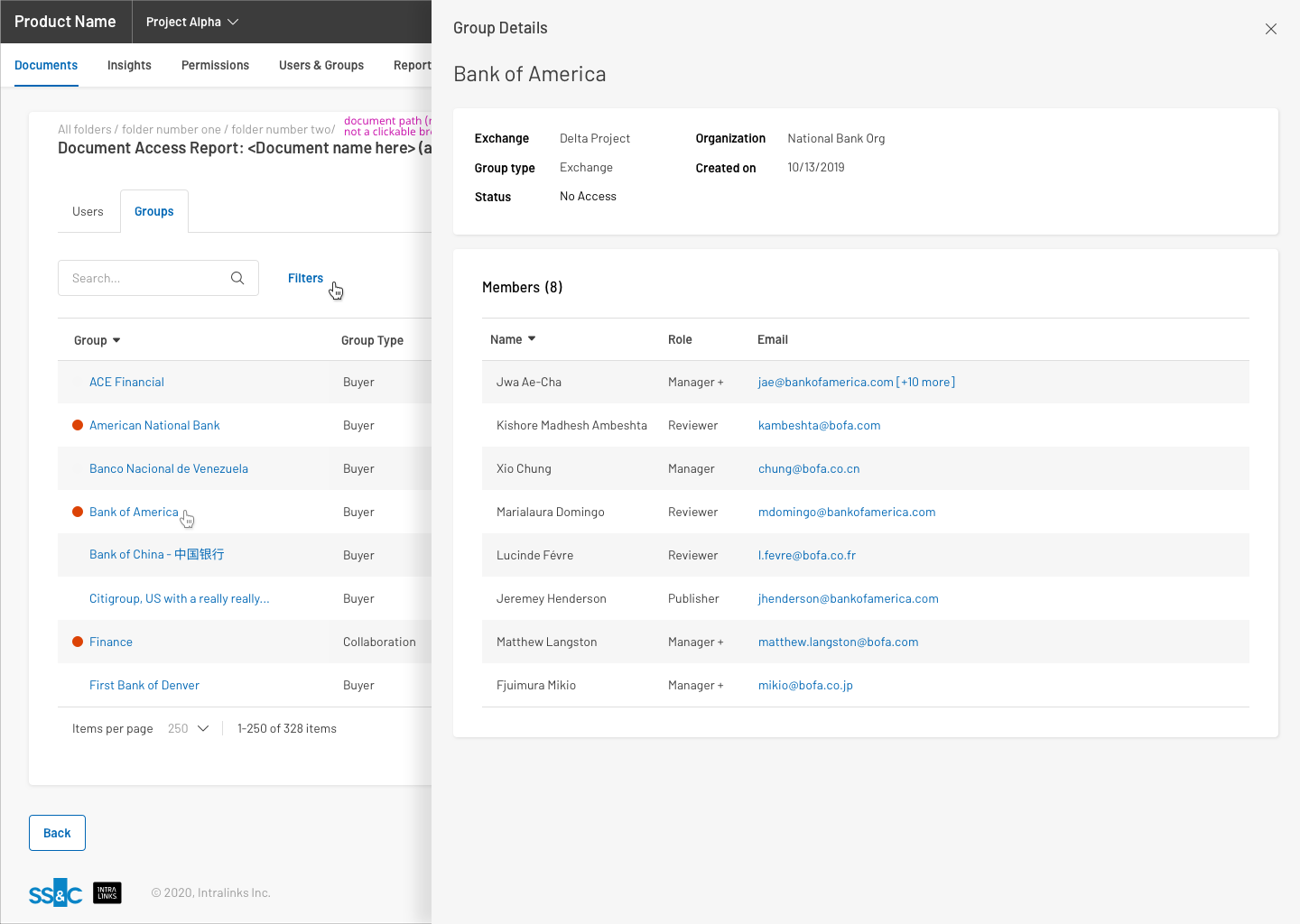
Users Tab - Details - No Access